Browsing Category

Design

Design

Tips for Creating a Winning Portfolio by Design Challenge Champ Tasha McKelvey

August 14, 2012

A great portfolio is a must-have in the visual world of design, but what’s the best way to build an eye-catching image collection? Ceramicist Tasha McKelvey captured our judges’ attention and won our first Ceramics Design Challenge with her uncommon piece. Here’s her advice on creating content to get the attention of art show judges, buyers like ours, and others in the art world.

Last fall I entered the UncommonGoods Ceramics Design Challenge on a whim. The holiday rush was already upon me, so I decided to take a few minutes and fill out the application right then. Otherwise, I knew I would end up forgetting and not enter at all.

Be Prepared

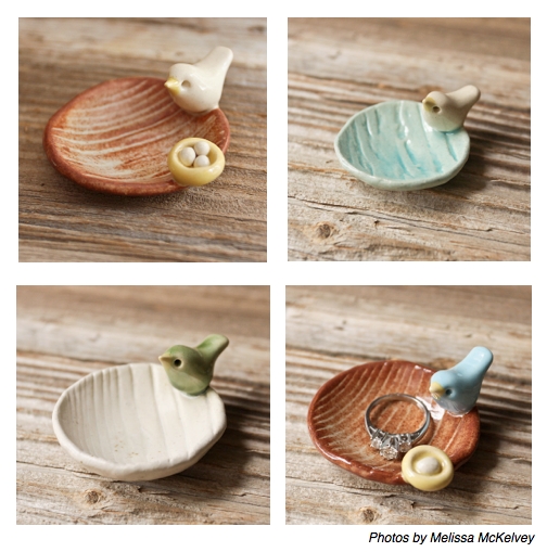
I already had an item to enter in mind. My Birdie Mini Dish would be a good fit for a catalog based on the size, price-point, cuteness factor, functionality and my studio’s ability to produce it both efficiently and in quantity.

Using relatively few images and words, I would need to effectively communicate all these details to the judges reviewing the applications for the Design Challenge.

With my entry decided on, I was able to pull my application together very quickly because I had already invested some time and thought into the process of portfolio presentation. The images I submitted for judging reflected the function, size and other options I offered for the mini-dish while still demonstrating the items’ consistent style.

This was the most specific mini-portfolio I have put together to date because it really only contains one piece of my work. I normally present a quite different group of images to craft show juries or gallery owners emphasizing the full scope of my work along with my particular style or voice.

Be Selective

Some time ago I created a Flickr portfolio of product images I had assembled for some indie craft show applications. I wanted to provide the show’s jury panel a link to a small selection of images I felt accurately represented my current ceramic work. Just sending a link to my website might have been overwhelming for a jury since it catalogs the entire diversity of my work. The smaller online portfolio I created on Flickr can also be a great resource to share with galleries, shop buyers, and the press.

Create a Cohesive Look

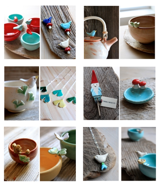
Additionally, the images are appropriate for uploading directly to an online craft show application that require image attachments for jurying. The individual images in my portfolio are actually composites; each jpeg consists of two images side by side. I combined the images using Photoshop, but there are lots of other programs available that can do the same thing. In order to better demonstrate the variety and relationships in my work, I chose to use two images in each “slide”. I put my bird bowls side by side with my ceramic bird necklaces, my ginkgo pottery with my ginkgo jewelry, my woodland gnome with my woodland mushroom mini-tray, etc.

Photos by Tasha McKelvey

Tell a Story

Take a look at the six “slides” that make up my portfolio. Notice the order I placed them in and the story such an arrangement tells. The first image is bold and eye-catching, while the last image references the subject matter as well as some of the colors in the first image (a little trick I also used with my UncommonGoods Design Challenge images too). Even though the backgrounds vary, each image shares the common themes of neutral colors and woodgrain — there is variety, but it is a consistent variety.

Know Your Audience

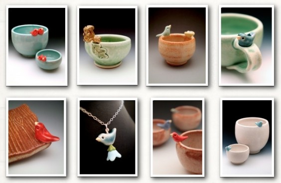
I use these images for indie craft shows and boutiques, but I do not always use these particular images for more traditional or upscale art and craft shows or galleries. For most non-indie shows I have a separate set of images with a gradient gray background. More traditional or high-end show juries have certain expectations for image presentation, and my casual woodgrain backgrounds might rub some of the more traditional art show jury members the wrong way. Also note that composite images are not recommended for non-indie shows in general.

Here are some examples of my images for non-indie art and craft shows.

Photos by Tasha McKelvey
The UncommonGoods buying team is always looking for great new designs. Check out our latest design challenge or show us your work through our new goods submission form.

Design

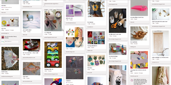
Justina Blakeney’s 5 Favorite Baby Pinterest Boards

July 30, 2012

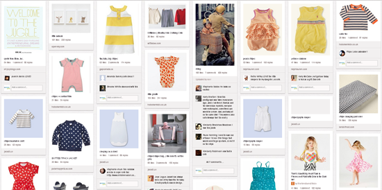
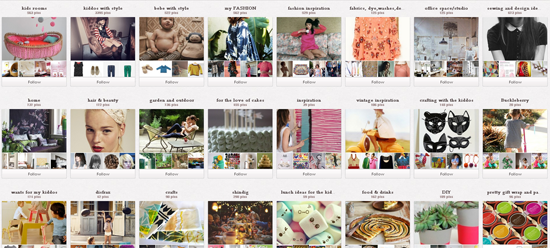
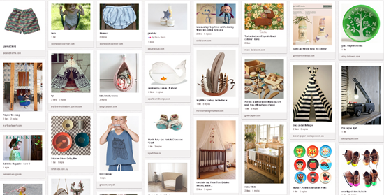
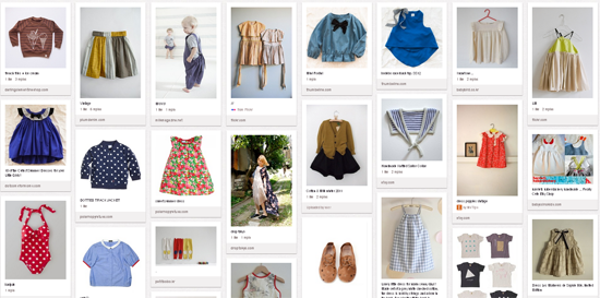
Hello fellow uncommoners! I’m Justina, a designer, curator and blogger and soon-to-be mom! (my due date is this week — ahhh!) I am also hopelessly addicted to Pinterest. I have over 50 boards that I use to collect ideas and inspirations for every aspect of my life. My Little Boomba board was instrumental in helping me to come up with ideas of how to decorate my nursery, what items to add to my baby shower registry, must have eco-friendly toys and clothes…and a ton of other wacky and awesome ideas. With over 1,000,000 followers on Pinterest, some of my pins were loved and some created quite a stir–but ALL of my pins got me excited to start this new chapter of my life as a mom.

I am thrilled to be here today to share The Goods with you: some of my favorite baby-centric Pinterest boards by some of the most stylish ladies around. These are mommas that have inspired me throughout my pregnancy and helped me get ready for this huge leap into motherhood. Get ready to start repinning!

Designer and Design blogger Joy Cho is a friend who has helped me a lot throughout my pregnancy–so open and positive, she’s been awesome. Her nine-month old Ruby also has some killer hand-me-downs. Her baby board is a fave, especially for the clothing.

Janet Sherman who has a kids clothing line, has a few really great boards for kids and babies–and I just dig her style. It’s playful and carefree.

My friend Sofia Alberti, who just had her second baby has my go-to board for boho baby finds, especially for decor. It’s a magical little place.


Hanae Ono’s Kids Wear board is another favorite.

Deborah Beau has several sweet kid’s boards, one of the most inspiring, in my opinion, is her Crafty and Creative and Colourful boards– with over 1000 really sweet craft ideas for kids.

Check out Justina’s favorite baby gifts from UncommonGoods!


main image by Annie McElwain. featured image by Bonnie Tsang. courtesty of Justina Blakeney.

Design

Fit to be Tied: Bethany Shorb’s Designer Drive

July 16, 2012

Bethany Shorb photo by Achille Bianchi, © Achille Bianchi

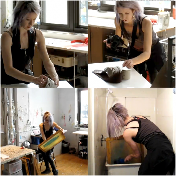
Bethany Shorb may be the founder, CEO, and principal designer at Cyberoptix TieLab, the fashion-forward brand that’s sold ties to all 7 continents (yes, even Antartica!), but despite her role as the woman in charge, she’s not afraid to get her hands dirty. Bethany still creates every single tie herself.

“To date, I’ve hand-screenprinted over 100,000 neckties, all by hand, with no automation, machines or even a press! I have to admit having quite a buff right arm to show for it,” she told us.

That’s an awful lot of ties since she launched her company in 2006, so how does she do it? She takes inspiration from everything around her, draws on her background in fine art, and has a little help from some, as she says, “studio bees,” who assist with shipping, customer service, website update, and keeping an ample supply of take out coming into the studio during busy times.

Bike Chain Tie photo by Luke Copping, © Luke Copping

This busy studio, a buzzing center producing artistic fashions admired all over the world, isn’t located in New York, Paris, or Milan. After receiving a BFA in sculpture, with a concurrent concentration in photography from Boston University (in the city where she was born) Bethany made the Motor City, Detroit, her home.

“I’ve been based in Detroit for thirteen years now,” she said. “I chose to move here to go to graduate school [receiving a MFA in sculpture, also with a concurrent concentration in photography, from Cranbrook Academy of Art ] and also chose to stay immediately after finishing. I realized there was vast opportunity here that diverged from the traditional New York gallery or art educator path. With the low overhead that basing a studio practice in Detroit affords, it also in turn enables one to take financial and aesthetic risks that one would not be able to take were money tight, student loans looming, distractions abound and space cramped. With access to a large amount of space, I was fortunate to be able to ramp up my production scale as soon as there was demand and in turn grow my business very quickly.”

Photographing and Screen Printing, Photos via Bethany Shorb

Bethany believes that customers are “tiring of disposable culture,” and finds that “increasingly people want to buy into a story, not just a product. They want to buy from real people making real things with real histories…” and Detroit doesn’t fall short when it comes to real people producing these memorable goods.

“Detroit’s makers provide that accessible story while also providing a product that fits the client’s needs,” Bethany explained. “Along with a great sense of community, Detroit is a wonderful home-base to make things.”

Perhaps Bethany’s love for Detroit will shine throughout her upcoming solo show at Metro-Detroit’s 323 East Gallery, which opens this October and uses reclaimed materials from the commodity that made Detroit famous. “Recently I’ve been exploring a series of screenprinted work on metal, paired with reclaimed automotive emblem text; and a series of sculptural pieces made from deployed airbag fabric,” she said.

Of course, the thriving art community in Bethany’s city isn’t her only source of inspiration. Her design ideas come from everything from current trends to the desire to reboot antiquated styles by giving them a modern flair.

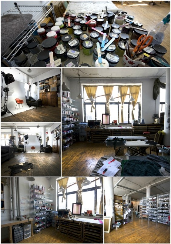
Cyberoptix TieLab Studio in Detroit, Mich., Photos via Bethany Shorb

She described a few places where she finds those sparks for new designs: “While I can still sometimes get caught up with the immediacy of pop culture (running an internet-business means I’m plugged in, non-stop), I like to look toward objects and ideas not made in the last five minutes, including natural history, medical ephemera, and Victorian botanical drawings and architectural renderings. Some of my favorite days are spent in dusty museum cabinets of curiosities or looking back at retro-future projections of what people thought it may look like in a hyper-stylized year 2000.”

Once Bethany has a firm image of the design in her head, she doesn’t spend a great deal of time “ruminating on other versions.” Always thinking about how the vertical shape of the tie influences each pattern, she begins manipulating photos from her own camera or digitally assembling the pieces that will eventually be the basis for a unique illustration.

“Once I think it’s about done, I’m pretty old-school about printing it out on tabloid-sized paper and just holding up the finished design over a few different necktie sizes on a lightbox and then burning it right to screen once it’s the correct size, ” she said. “I’m not a fan of rulers.”

Her aversion to rulers certainly hasn’t stunted the quality of her work, and we’re thrilled to offer several Bethany’s latest creations. When asked which of these designs is her personal favorite, she was a little indecisive, but answered with two options that happen to be on our favorites list as well.

Beer! Hops Tie. Photo by Bethany Shorb

“I’m definitely guilty of being seduced by the new, so probably my most recent design, [the Bike Chain Tie] is my current favorite,” said Bethany. “I’m also particularly drawn to the more pattern-based designs, ones that look like a traditional necktie motif, but have a little something extra hidden within the pattern that you might not realize is there until up close to the wearer. The Beer design is a near second – ties proclaiming one’s affinity for the tasty beverage are not always the most elegant, so I enjoy being able to put a different spin on the often less-than-classy beer tie.”

Finally, after giving us a look into her creative and technical process and providing a little prompt to those who aren’t quite sure which stylish tie to purchase first, Bethany also left us with a bit of advice on seeking an education in art and aspiring to build a business in art, design, or even another seemingly unrelated field.

“I like to think that my schooling in art taught me how to design and see in a holistic manner, rather than the simple mastery of a particular craft, technique or tool,” she said. “I firmly believe a quality art education can be applied to any discipline.” She went on to explain, “I’m completely self-taught in screen printing aside from one messy afternoon session on my friend’s kitchen table.” Evidence that learning the basics, and keeping an open mind when looking at the big picture, can go a long way.

Design

Noteworthy Design: Wedding Wishes

June 8, 2012

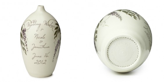
Picking a personal wedding gift is tricky. It has to be sentimental, but not too cheesy. Functional, but with more appeal than the stereotypical kitchen appliance. And, of course, it should be something the couple will cherish for years to come. Our community agrees, David Voorhees’ Personalized Wedding Wishes Vase has it all.

Time and skill go into creating each of these wheel-formed, hand-decorated pieces, but using the finished product is actually quite simple. Each vase comes with a wedding poem (written by Voorhees) and blank sheets for writing your own wedding wishes.

The couple can use the vase instead of a traditional guest book, or place it near the guest book table. As guests enter the reception, they are asked to write their very own special messages to the couple and drop them into the vase for the newlyweds to read on their first anniversary. Since the bottom of the vase is perforated, the artwork doesn’t have to be destroyed for the messages to be enjoyed a year later.


Our buyers loved the handmade vase the moment they laid eyes on it, but wanted a little “relationship advice” before making the commitment to carrying this uncommon good. Our voters agreed that the custom creation is certainly something special.

“This is a really great idea, beautiful and made in the USA,” Christie told us.

Renee agreed, “I think it sounds like a great idea, and gives lots of warm thoughts on the 1st anniversary…”

“I love the idea of opening this on the couple’s first anniversary! The perforated bottom is fabulous, since I would hate to wreck the vessel otherwise,” said Alli.

Now Voorhee’s design is an UncommonGood, and it’s receiving fantastic reviews from those celebrating the marriages of loved ones in their lives.

“This was the perfect answer for a wedding gift for a couple who were older, found love again, had two households to contend with and needed no more appliances or other like items,” explained Judy the aunt from Long Beach, CA. “Family and friends were able to write notes they will open in a year. What a nice way to wish a new happy couple on their way.”

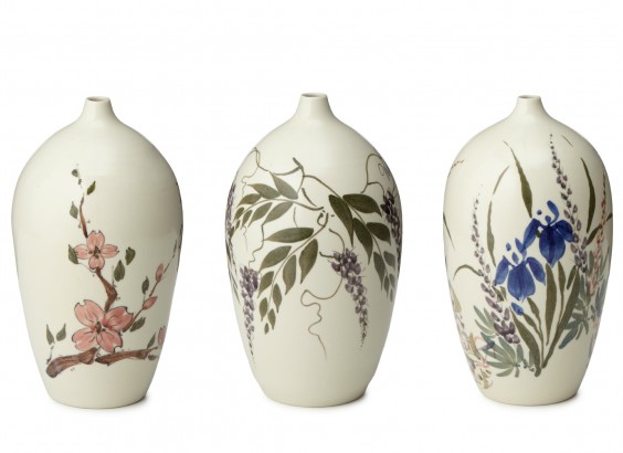
Mary from Ashville, NC also shared a 5-star review: “This is my absolute favorite wedding gift to give! It is a beautifully hand thrown vase that has a personalized message on one side with a floral design hand painted on the other side. At the reception, guests are encouraged to write a personal hand written message to the couple on paper and put it into the Wedding Wish Vase. Then, a year later, on the couples first wedding anniversary, they open the vase and read all the messages the guests wrote to them on their wedding night! How awesome!! This is such a lovely, unique, personalized, meaningful wedding gift.”

We’re proud to see such wonderful feedback coming in for such a clever and beautiful handmade piece. We’re looking forward to feedback from happy couples as they open their Wedding Wishes Vases to read warm messages and words of wisdom in years to come!

Design

Moodboard Tutorial from Inspired to Share

May 21, 2012
image by Woodnote Photography


My name is Colleen and I am the creator of design and lifestyle Inspired to Share. I’ve been blogging for three years now and it has continually sparked my interest and desire to learn more about graphic design. I now find myself playing in Photoshop every day and I love experimenting in design to create original blog content. One of my favorite posts to create is a mood board. Lately, every Monday I’ve been posting a “Monday Mood Board” blog post as a way to share inspiration that I’ve discovered around the web. Mood boards are a great way to do more than just look at inspiration, but to really make it your own. I also find they can help with developing projects and concepts. I don’t know about you, but I spend a lot of time on Pinterest. Sometimes I want to look at multiple pins of images at the same time, so that I can see them all together. Or maybe I want to show my own interpretation of the images. For example, say I’m creating a concept for a new style post, a mood board can help serve to refine my ideas and vision. I like to gather inspiration everywhere, including everything from art, interiors, photography, styling to design and typography. Mood boards bring all of these areas together while formulating my overall aesthetic and color scheme. It’s really quite fun! Plus, I know I love looking at others’ designed mood boards, and they always inspire in new ways.

So now that you know why mood boards are so great, let’s create one!

1. The very first step is also the longest: selecting inspiration photos for the mood board. I like to turn music on that inspires me (lately I’m obsessed with this website) while I look. There are endless sources of inspiration on the Internet, and I think we all could spend days looking for cool and creative finds! I usually peruse other blogs and Pinterest to look for photos that catch my eye, doing my best to hunt down the original sources. I usually select anywhere from 5-10 photos.

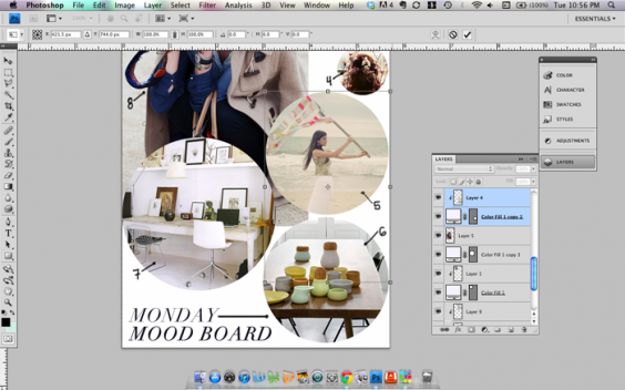
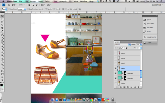
2. Next, drag all the photos into Photoshop and put them on one canvas. Simply dragging the photos from your browser into Photoshop saves the step of saving each individual file and reopening it in Photoshop! And putting them on one canvas begins the process of designing the images together. I’ve found it’s helpful to work on a square canvas in Photoshop so that I don’t feel confined to the narrow dimensions for my blog.

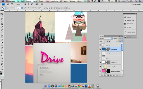
3. Begin to arrange the photos and create your own layout. One technique I recommend is to fit images inside shapes according to the size and area you need to fill. That way you can fit all of the photos even if they don’t match the exact dimensions of your canvas.The options are endless. You can add borders, numbers, shapes, textures, type, and writing or drawing (I like to use my Wacom tablet!). This is the fun part! Be creative and have fun with it. There are no rules! Below are some screen shots of my mood boards in progress.

4. If you decide to share your mood board anywhere online, make sure you credit the original photo sources and link to where you found each image. This is an important step not to be overlooked! I try to find the original source of all photos, if possible (Pinterest doesn’t count!). Original sources so helpful when reading other blogs and it’s important to give credit where credit is due.
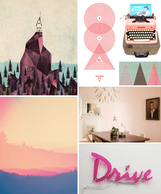
I always try to add a little something new in my designs to keep it fresh. Below is an example of a finished mood board that I made recently.


(sources: art by Andrew Bannecker, design by Nick Tibbetts, typewriter from joe vintage, photo via mr. serio, sfgirlbybay’s home by bonnie tsang, sign by Rizon Parein)

I hope you’re inspired to make your own mood board! I’d love to hear if you have any tips or tricks as well.
A big thanks to UncommonGoods for having me! Now go get inspired! xo

Design

The Judges, the Lunch and the Winner!

April 25, 2012

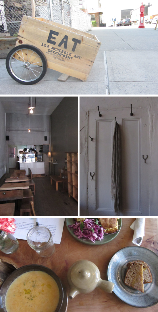
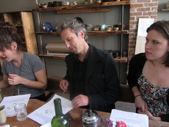
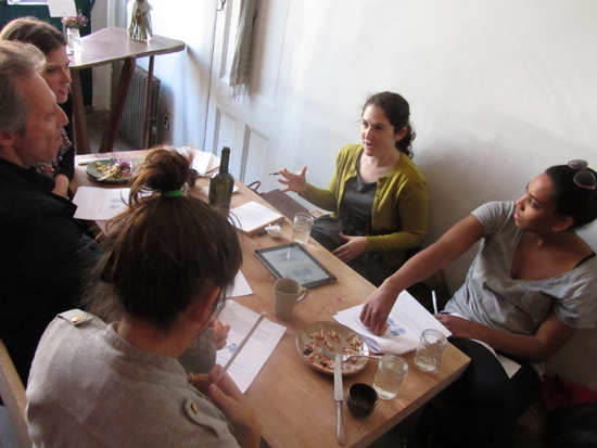
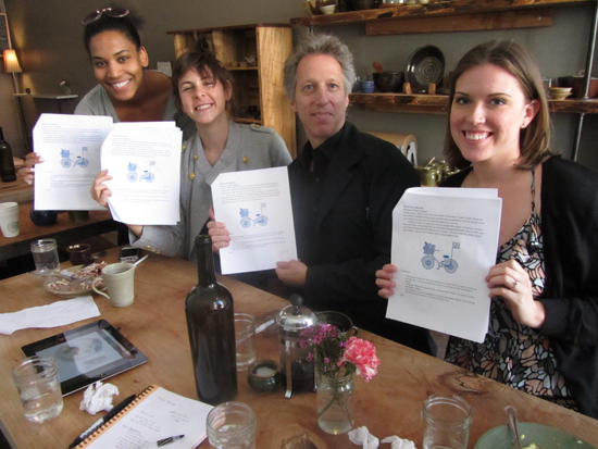
 Last week the judges of the Summer Picnic Design Challenge met at Eat in Greenpoint, Brooklyn to discuss the top five voted designs and decide on a winner. Around the table were Candace, the tabletop buyer for UncommonGoods, Ian Yolles from RecycleBank, and Jessica and Emily of Susty Party. The food was farm fresh, the weather had us in the mood for a summer picnic and the judges were ready to deliberate.

Blown Dandelions by Kendall Walker won the popular vote. The design reminded Candace of being a little kid and blowing dandelions in her back yard. Jessica loved the simplicity of the lines yet thought the image had movement.

Jessica loved that Watermelon by Tanya Alexander was such a solid design that would use a lot of ink and look really bold on a cup and plate.

Jitterbugz by Caty Batholomew was a favorite of Candace. She thought it was a great design for a family and had a fun illustrated style. To her it screamed summer and she thought it would get people excited about the warmer months and upcoming picnics.

Bonnie Christine’s Nature Walk- Bird made us all want to “put a bird on it”. Emily thought it was a very pretty design and would look nice on anything, especially sustainable dinnerware.

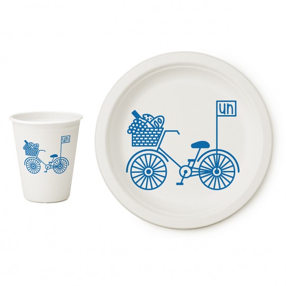
But the design that stole the judge’s hearts was Danae Douglas’s Bike. Ian loved that Danae’s design promoted sustainable living and made him happy as an avid biker. Emily thought the design made living an eco-friendly lifestyle look very glamorous. Jessica loved the clean, crisp lines and Candace reaffirmed that UncommonGoods shoppers love bicycle designs and thought it would be a big hit.

 We asked Danae about the inspiration behind her design. “I wanted to show a picnic as an opportunity to enjoy the outdoors, as well a chance to travel greenly to get there. Biking is an excellent way to stay healthy, to take in your surroundings, and to get you where you’re going without doing any harm to the environment (and it’s also really fun!).”

To stay creatively inspired, Danae peruses books and magazines in addition to staying on top of local and global issues. “As a designer I think it’s really important to be globally minded and try to take in as many different perspectives as you can.”

Help us congratulate Danae on her victory in the comments below. She won $500 and will see her Bike design stamped onto sustainable cups and plates from Susty Party and sold at UncommonGoods.

Design

How to Make It Video

April 20, 2012

So you couldn’t make it to our first How To Make It event last month. No more worries. Here is a video of our panelists Tina, Ana, Jeff and Nickey sharing their design and business experience. They discuss everything from expanding your staff and to picking a name for your brand.

More events coming soon, on everything from branding to green design. Leave a comment if you have a suggestion for a future topic!

Design

Everyone’s Talking About our Art Contest

April 13, 2012

If you haven’t entered our Wall Art Design Challenge yet, there’s still 2 more weeks to enter!

Chris Olson of Momathon Blog says, “Now is the perfect time to enter your original artwork.”

The Shillington Design School thinks it’s a great opportunity for students.

The Harlem Arts Alliance encourages New Yorkers to apply.

Megan Patrick from How Design did a round up of her favorite art and encouraged all creative types to enter.

And our guest judge, James Gulliver Hancock tweeted, feel like making some wall art? enter here – http://www.uncommongoods.com/designs/art-contest and I’ll decide if it’s good enough 🙂

So what are you waiting for? We’re accepting any work you already have in your portfolio, and you could win $500, see your work sold as a limited edition print at UncommonGoods, get a one-on-one critique with our guest judges and more.

We can’t wait to see your artwork!