Browsing Category

Design

Design

The People Feeder: A Charming New Way to Serve Snacks in Style

November 24, 2015

People Feeder | UncommonGoods

The People Feeder

Colorful feeders dot the landscape below as you soar above; you swoop down for a quick bite. A passing bird, you need just perch and eat, with gravity doing the work as you nibble to your heart’s content. The snacking freedom birds enjoy with bird feeders inspired us when we first considered Francine Zajac’s design, intended to facilitate a similar fly-by snacking with her glass and ceramic concept.

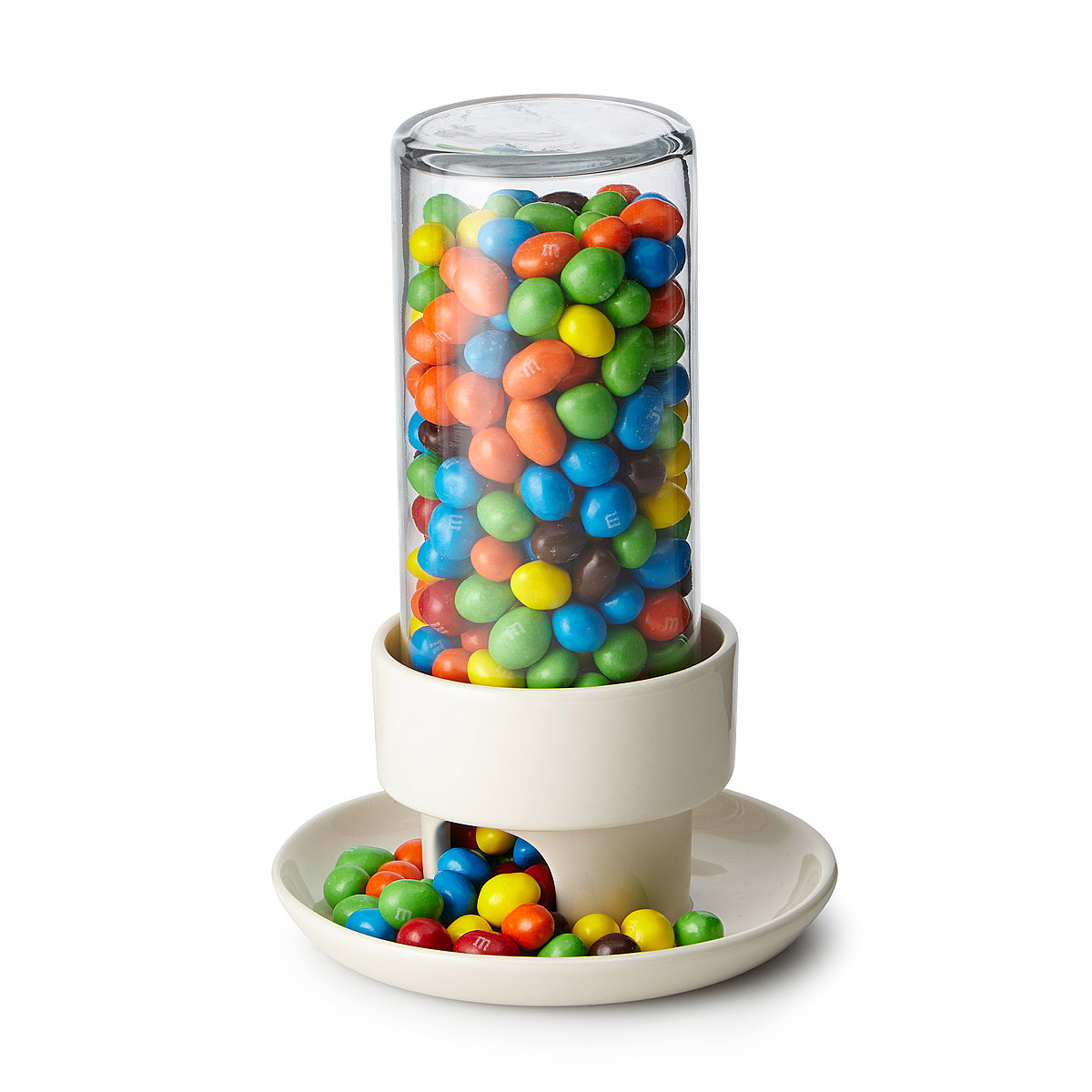
Francine is a potter of over 30 years, and had been producing her own feeder snacker with a ceramic base and repurposed mason jar. The design was simple but effective, employing gravity to direct candy down through the mason jar, the ceramic chimney, and out through the arched opening, filling the dish with just enough to enjoy a handful while ensuring an even flow after each sampling.
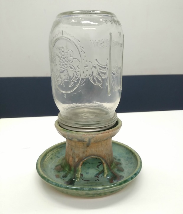
People Feeder - Zajac original design | UncommonGoodsWe sought to re-imagine Francine’s design by incorporating sleek and clean lines and components, and providing enough capacity for even the most ravenous snackers. In doing so we needed to identify the attributes important in making the original design functional and effective. As Production Manager, I was tasked with working as a liaison between our design team and our manufacturer of the item, to ensure that our design was both appealing and executable.

With such a unique item, both in form and function, much thought went into balancing the impact and function of the item with how it is made and the capabilities and limitations of ceramic, a medium that can be notoriously tricky to predict after it goes into a kiln.

We started the design process from the top down with the glass cylinder. Its selection was important, as we needed something lightweight that showcased the snack. The separate glass cylinder also allows for a simple and straightforward way to fill and clean the feeder. From there, we considered how the base would be shaped and how it would function in conjunction with the glass piece.
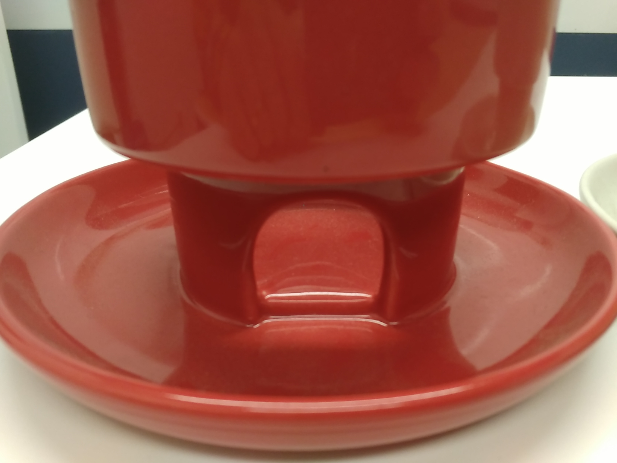
People Feeder base | UncommonGoods
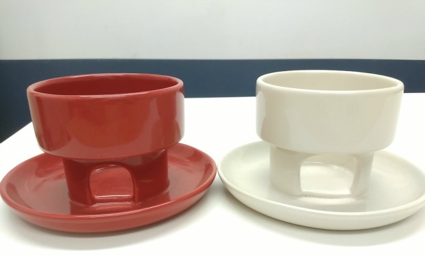
The base would employ a ceramic chimney similar to Francine’s but provide a deep shelf to adequately hold and maintain the clear cylinder. The base of our Feeder also took into consideration the need to manage the amount of snacks fed at any given point, so as not to drain the cylinder and flood the saucer. We originally conceived the bottom saucer as having a vertical, 90 degree angle lip to keep the snacks from flowing over the edge when entering the saucer. However in testing the sloped edge saucer, we found that it wasn’t necessary. The snacks did not flow over, yet were easier to grasp at then they would be with a vertical lip.

Our first prototype worked fairly well. We found the capacity ideal and the gravity fed the M&Ms we tested nicely, providing just enough of a handful at a time. But things were complicated when we tried other snacks. Peanut M&Ms, for example, were easily crowded at the exit point of the chimney, bottlenecking to the point that none were able to escape. A wider opening was the clear solution, but not too wide that a smaller candy would completely pour out.

People Feeder prototype bases | UncommonGoods

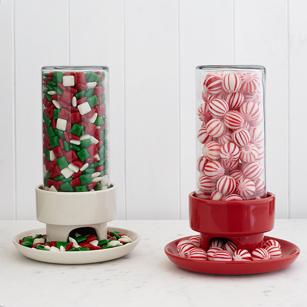
Our revision worked very well, allowing for candies both large and small to successfully pass through while collecting in the dish. With a design successfully worked out, our final step was selecting the right color. We chose a warm, white glaze that would fit well in most decors, as well as a bold red, reminiscent of a similar, nostalgic dispenser of candies: the gumball machine.

Fill and enjoy!

People Feeder | UncommonGoods

See the Collection | UncommonGoods

Design

Maker Mentors Holiday: How to Make Your Holiday Season a Success!
September 14, 2015

Maker Mentors Holiday

Last spring we were super excited to team up with the folks at Maker Mentors to offer webinars with a few of the artists we work with here at UncommonGoods. We heard some great feedback about the online conference, so when we heard that the event is back for a one-day pre-holiday maker education extravaganza, we couldn’t wait to get on board.

Maker Mentors Holiday is September 19. The online conference will focus on helping makers make the 2015 holiday season a success and features 10 live-streamed sessions. (Including one with me, where I’ll talk about storytelling and content creation.)

Register now with the code UNCOMMONGOODS for $25 off, and don’t forget to sign up for the Maker Mentors newsletter for more from the Maker Mentors community.

Design

Inside the Uncommon Collection

July 13, 2015

Uncommon Collection by UncommonGoods

Visit the Uncommon Collection

One nice thing about UncommonGoods is that you don’t have to think too hard to get what we’re all about. In fact, it’s right there in our name—a collection of goods that are, well…uncommon. But the name also plays with the concept of the “common good,” and that’s another big part of what we’re about—the conviction that doing good in the world is also good business. Now, we’re proud to introduce the Uncommon Collection, an exclusive assortment of products that meet our highest standards for uncommon design, sustainability, and doing good. We don’t want to make this debut uncommonly complicated, so we went to our founder and CEO, Dave Bolotsky, for an inside look at this exciting new initiative.

UncommonGoods Founder and CEO David Bolotsky

UncommonGoods Founder & CEO Dave Bolotsky

How was the Uncommon Collection conceived and when?

It’s connected to the founding of the company itself. The ideal is really to offer the best of what we sell and put a special designation on that. From the beginning of UncommonGoods, we had a handmade symbol and we had a recycled or environmentally-friendly symbol that we would put on products on the site. I always thought that that was a good first step, and that we ought to do more because I felt that told part of the story, but not the whole story. Back then, I had seen articles written about sustainability seals and how various companies were giving a scorecard for their products, and I thought that would be a great thing for us to do. When I started looking into the complexity of that, it was extremely daunting. B Corporation—which we joined back in 2007 when it was first created—has an entire Nonprofit and Standards Committee organized around this, but as a relatively small independent business, we didn’t have the resources to do something like that. But two years ago, we started talking about it seriously again: creating the Uncommon Brand. We own the legal rights, not just to the trademark UncommonGoods, but we actually have the legal mark ‘Uncommon,’ and I thought it would make a lot of sense to use that name to signify the product that we were most proud of, both from a design and sustainability perspective as well as product that was only available at UncommonGoods.

Was part of the decision to renew interest in the past two years based on having a critical mass of the collection? Some of those products have been around for a little while. Why do it now?

It’s a combination of, as you pointed out, a critical mass of the products. It’s also a resource question. We have a deeper and stronger team today. My belief – and I think [Director of New Business & Product Development] Carolyn’s belief – was that we’re capable of pulling it off today and doing it well, whereas in the past I think both because of the products we had and also the number of things we had on our plate, it would have been more of a struggle.

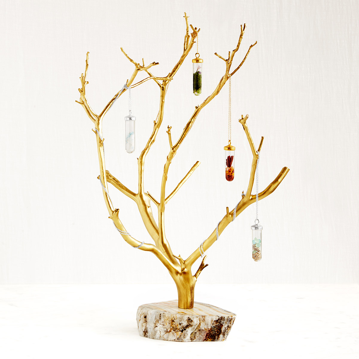
Gilded Branches Jewelry Tree | UncommonGoodsGilded Branches Jewelry Tree | by Michale Dancer and Still Life for the Uncommon Collection 

Can you talk a little bit about the responsible business practice piece of it – particularly the fair wage issue? You’ve been an advocate for that, and it’s one of the five factors for the Uncommon Collection.

It starts here, meaning that I don’t want to advocate that other people do things that we’re not willing to do or proud to do ourselves. From the beginning, UncommonGoods has paid meaningfully above the minimum wage, principally because: number one, we want to attract great people; number two, we want to treat people with dignity and respect, and paying people a fair wage is part of that. From a policy perspective, one of the often-overlooked elements of the minimum wage debate is the fact that when other businesses pay a wage that somebody cannot live on, our society has said “we need to give that individual help.” And so we as taxpayers are spending money on social support in the form of food stamps, in the form of housing assistance, and in other ways. That in effect is a transfer payment from us as taxpayers to the business that is paying the substandard wage. I don’t believe in that. I believe in fair competition and I don’t think it’s reasonable from a businessperson’s perspective that we should have to compete against another company that’s getting government assistance to support its workforce. I also don’t like it as an individual taxpayer. I also think that, as an individual, there’s a lot more dignity in getting the money from your employer for the work that you do than having to apply for food stamps or medical assistance or housing assistance.

It’s almost like some companies deny that connection—as soon as the person leaves work there’s no responsibility, they’re not making that connection between all of that public assistance and work life.

Right. People are not tools. People are not machines. The fact is that as a business, you can look at human beings as simply an item on your profit and loss statement. The problem is that we are brothers and sisters and I don’t think it’s healthy to compartmentalize your life and say “I’m a businessperson during the workday, and I’m a human being and I care about my community and my society outside of my work.” You’ve had folks in the past like the Carnegies and others who amassed tremendous wealth—and late in life perhaps felt tremendous guilt about how they went about achieving their financial gain, and then did these wonderful philanthropic things. My view is: run your business on a day-to-day basis in a way that has a positive impact on society and the environment, and then you don’t have to have a crisis of conscience when you’re older and wondering what your legacy is going to be.

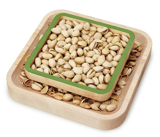
Pistachio Pedestal | UncommonGoodsPistachio Pedestal |  Created by our Product Development team and J.K. Adams for the Uncommon Collection


What other tenets of the Uncommon Collection have roots in the core values of UncommonGoods – in particular, in your original vision for the company?

If you think about other living things in the world, like a tree: What does a tree do? A tree provides shade. A tree gives many positive things. It takes and gives. And there’s some sort of question about what we as human beings give compared to what we take.

Does business inherently do good? Well, on one hand we’re a jobs program. We employ people. We provide health insurance. We provide opportunities for learning and personal development and growth. But there’s also a lot of damage that business does to the environment. So I think about how we are shipping packages to customers’ homes and that requires the use of a lot of natural resources. Some of the idea is “how can we do this in a way that has the minimal negative impact?” If we’re selling product, do we want to sell product that’s harmful to individuals or harmful to the planet? From day one we have not sold product that involves harming animals, and continue to do that. I think that’s a positive step. We also won’t sell anything, and haven’t for years, that has PVC or BPA—other harmful chemicals. That’s something that we promote pretty aggressively. We’ve gone further in the Uncommon Collection in terms of the materials standard and in terms of the packaging standard. We’re working with a handful of our suppliers who share that vision.

So it stands to reason that we’ll work with more and more suppliers whose practices are aligned with the standards that we provide?

I would say there are two ways to look at it. Do we want to work with more suppliers that have a positive impact and work to limit their negative impact? Absolutely. I would love it if our existing suppliers travel on the same journey that we’re on. I view this as climbing a mountain with lots of false peaks. Meaning you think you might be getting close to the top, but there is no top. It’s a very humbling exercise. The idea is that we want to keep working to get better and we have to draw the line somewhere. With the Uncommon Collection, this is the bar that we have to hold ourselves and our makers to—and we’re going to work to continue to raise that bar. We’re going to work with artists and makers to help get them over that bar. So I would say it’s less about finding new suppliers that share that vision and more about helping existing partners adopt more of these practices.

Jayne Riew | UncommonGoods

Designer Jayne Riew’s Meditation Box is featured in the Uncommon Collection.

What was the hardest thing about getting this project up and running?

Well, our Product Development team did the hardest work, but I think it’s extremely difficult to create commercially successful, brand reinforcing products. If you then layer on top of that the social responsibility standards you end up making it perhaps twice as difficult. It potentially increases the cost, and you potentially lose suppliers. So there are products that we’re offering that we designed and developed that we had hoped would be part of the collection, yet we couldn’t get our supplier to adopt or achieve all of the standards, despite our best efforts. So I would say that was the most difficult part. I think there’s an emotional element and as an independent business person, as an entrepreneur, the thing I like least is being told what to do. There’s an element of Big Brother in this that doesn’t sit totally right with me, where we might be perceived as telling our vendors how to run their businesses. As uncomfortable as that may be for me, I think that it’s an even more uncomfortable thing for some of our vendors. Articulating that this isn’t coercive—this is a voluntary program where we want to highlight those companies that we think are exhibiting best practices. I think that’s the most effective approach.

Were there other challenges?

The issue of transparency has been a big hurdle—we’re requiring that all participants, including UncommonGoods, disclose their environmental and people standards, including starting wages and benefits. We’ve been doing this since 2007 as part of our B Corporation certification, but it’s a new request for our suppliers. We think it’s essential to do this. Having to publicly state your policies makes it far easier to verify the statements.

A second challenge was that we have been basing most of our wage work on the MIT living wage calculator. There was recently an update to that which dramatically increased wages across the board. Apparently, that calculator had not been kept current and the most recent update ended up being much greater than we had anticipated, so we had to modify, but not eliminate, the wage standard that we used.

What do you hope the Uncommon Collection does for our brand and collection as a whole?

I think our main goal with this is to encourage more socially-responsible practices among our vendors. This program will be successful as we see more of our suppliers adopting or meeting the standards that we’re setting out. From a branding perspective, I’d like customers to see what we do behind the scenes. People don’t think about the fact that we’ve got a very sizeable chunk of space here in Brooklyn dedicated to warehousing and shipping products out to them with workers who are paid close to double the federal minimum wage. We could’ve chosen from the beginning to outsource our shipping, and most companies in our position have done that; and I think getting our customers to think a little bit more about the implications of where they shop and what they buy would be a hope for this program. Ultimately, the product’s got to look great, it’s got to be reasonably priced, and it’s got to be something they’re going to love or the recipient is going to love. To me, that’s number 1 through 9 in terms of importance, and number 10 would be “hey, is this product having a positive impact?” I think for many of our customers, that’s on the radar. For some of them, my hope is that this will get it on the radar.

Catherine Weitzman | UncommonGoods

Jewelry artist Catherine Weitzman’s My Lucky Stars Necklace , Four Season’s Necklaces, & Seasons Terrarium Necklaces are featured in the Uncommon Collection.

What about the Uncommon Collection’s focus on tabletop items and jewelry?

In the case of jewelry, I would say both the jewelry maker’s philosophy and the skill required to create the product lend themselves naturally to meeting these standards more easily. In the case of tabletop, our Product Development team—which is behind the Uncommon Collection—has spent many years focusing on this category and I think has great vendor relationships and a fairly high level of expertise around production and materials in that category. So I think that it’s more of a function of our history, and my hope is that we’ll see this expand to be represented throughout our assortment.

Where do you see this collection a year from now?

Ideally, I’d like to see it double in size, if not more, while not lowering the standards and hopefully gradually raising the standards.

What is your favorite item in the collection?

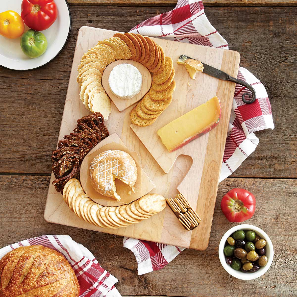
We’ve chosen to highlight the On The Other Hand Clock, and I think that’s a great combination of design, environmental sustainability, and a company that treats its people well. I also really like the ampersand Cheese & Crackers Board and the newest product form that partnership—the Pistachio Pedestal—as someone who happens to love both cheese and crackers and pistachios. I think that design is really clever, as is the Cheese & Crackers Board.

Cheese & Crackers Board | UncommonGoodsCheese & Crackers Serving Board | Created by our Product Development team and J.K. Adams for the Uncommon Collection

Anything else you want the customer to know about the collection?

I’d love to hear from our customers in terms of what they think about what we’re doing, any suggestions that they have, any other companies that they’ve seen who have ventured into something like this where we might find inspiration, and any other ideas that they might have. I’d also say I’d love to hear from our vendors, both existing and potential future parts of the collection.

Please tell us what you think of the Uncommon Collection by emailing feedback@uncommongoods.com.

It was interesting that at some point we were thinking about calling it ‘The Uncommon Brand’ and that changed to ‘Collection.’ Is that a good way of characterizing it?

Yes. We went back and forth quite a bit on the Uncommon Brand versus the Uncommon Collection, and it may seem like a very minor thing. But I would say that in our eyes, regarding the Uncommon Brand, when you think of a brand, you think of a singular aesthetic: a singular look and feel. Part of the charm of UncommonGoods has been that we’re a big design tent. We love modern design. We also love handmade products. And we felt that if we created it as a brand, it would be difficult and potentially confusing to have products with widely varying aesthetics living under that same roof. A collection felt more natural to us in that this is a standard. The product has to be well designed, yet it doesn’t have to be a particular design or look, but it does have to meet a certain set of criteria.

So ‘Collection’ allows it to be more eclectic.

Yes, more like UncommonGoods itself.

We invite you to browse the Collection and see how our focus on people and the planet—plus lots of exacting work with our suppliers behind the scenes—has produced an assortment of some of our most uncommon goods.

See the Uncommon Collection from UncommonGoods

Design, The Uncommon Life

Uncommon Design School: Underground Artists

July 1, 2015

Like many New Yorkers, if I need to get somewhere, I take the subway.

Whether I need to hop the train to travel from my apartment adjacent to Prospect Park down to UncommonGoods’ headquarters at the Brooklyn Army Terminal, or I’m bumbling through the Big Apple’s other boroughs on the weekends, cramming into crowded subway cars is as New York City as pizza pie. And like the more than 5.5 million passengers the system carries on an average weekday, the moment I step on the train I succumb to modern “tunnel-vision:” I bury my head in my iPad until I reach my destination. But when I step out of the train, I’m consistently surprised with the rich history laid bare in front of me in the form of the station’s diverse signs, vestiges of past design trends, fashions, and the mores of bygone generations.

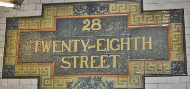
From its opening on October 27th, 1904, New York City had already envisioned the subway as more than a simple method of getting around the metropolis. While urban, the experience of riding the subway was intended to be urbane; from the beginning, the city hired artists to embellish the underground walls with fanciful, yet legible, decorations.

From 1901 to 1908, John L. Heins and Christopher G. LaFarge designed the earliest subway motifs in the popular Beaux-Arts style, evoking classical architecture using ceramics, metal, and wood. The Philadelphia-born architects – who are also known for their work in the Cathedral of St. John the Divine and the original Astor Court buildings of the Bronx Zoo – were heavily steeped in the Arts and Crafts movement, an international artistic trend that advocated traditional craftsmanship and striving to create environments in which beauty and technical skill were of paramount importance.

title_ny_eastside_28

Twenty-eighth Street subway sign by Heins and LaFarge

Accented with swoops and curlicues, cornucopias and floral medallions, the duo’s elaborate terra cotta signs endure as some of the system’s most recognizable emblems.

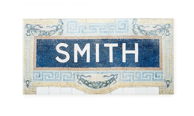
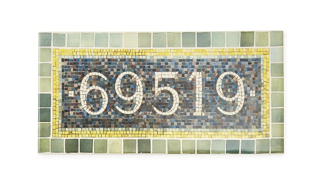
Tile inspired by the original  Times Sq-42 St station, designed by Heins and LaFarge | Personalized House Sign – Times Square Subway

While quiet compared to the glitz and hubbub of Times Square above, Heins and LaFarge’s sumptuous mosaic sign is an unmistakable symbol of New York’s vibrant urban fabric. The original sign that inspired this tile is located at at Times Sq-42 Street, one of the system’s oldest stations at 111 years old.

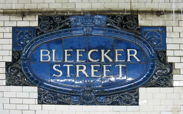
bleecker_lg

Bleeker Street subway sign by Heins and LaFarge

The elaborate tile-workings were not just decorative: each sign’s unique palette and patterns were used didactically to help non-English speakers identify stops.

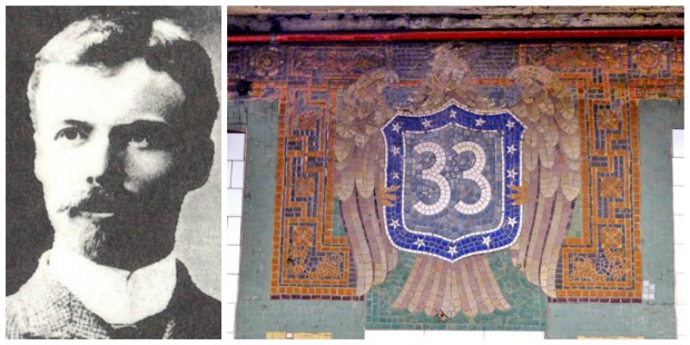
The team’s successor and owner of arguably the coolest name in New York City history, Squire J. Vickers took over as chief architect of the New York City Subway system in 1906. Known as an “underground Renaissance man,” Vickers was responsible for more than 300 stations—the most of any architect—and was the system’s lead designer for almost 30 years.

Squire J. Vickers and the “Vickers Eagle” at the 33rd Street Station

Vickers took the subway on a much more pared-down, modern path than that of his Beaux-Arts predecessors for both aesthetic and economic reasons. As the floriated embellishments that defined the Arts and Crafts style gave way to the slick lines and austerity of the Machine Age, Vicker’s signs reflected the era’s dominant graphic trends with their quilt-like geometric abstractions and bold colors.

19317347

Mosaic panel by Squire J. Vickers

“How grateful to the eye is the wall surface unbroken by paneling, noxious ornament, or the misplaced string course, decorated, if you like, inlaid with color, but unbroken,” he wrote.

Vickers was also imminently practical and, especially during the Great Depression, many of his aesthetic decisions were driven by the bottom line. Mosaic elements were flattened, for example, so they would be cheaper to clean (“to avoid dust ledges,” he wrote). The intricate signs could also be set by hand in a factory instead of on the wall tessera by tessera, making them less expensive to install.

wall_lg

Wall Street Station sign by Squire J. Vickers

Despite budgetary constraints, Vickers, who was also a competent painter, was still able to create mosaics revered as much for their utility as their beauty.

Inspired by Vickers’ oringal designs | Personalized House Sign – 59th and Lex Subway

Vicker’s decorative details underground, at the Lexington Av/59 St station, complement the sophistication of the Upper East Side above.

To this day, the MTA commissions artists to continue the creative vision that was an integral part of the subway from the very beginning. New works are installed every day, from traditional mosaics, to sculpture, stained glass, and more, giving passengers plenty to see—as long as we’re willing to look.


TN4JZopxJZRXhpq2R7iUYgCPURYoMPQyHfgQu3ThxfU


Design

Technically Speaking: Toys, Technology, and the Joys of Tinkering

May 6, 2015

A decade ago, Steven Johnson countered conventional wisdom with the audacious proposal that electronic media consumption is a beneficial societal force in Everything Bad is Good For You. Johnson makes a thoroughly convincing argument that an all-you-can-eat diet of TV and video games is actually good for people’s problem solving skills and overall IQ. Still, some will always be wary of too much technology, and more recent initiatives like Gever Tulley’s Tinkering School seem to encourage a return to hands-on experience and inventive play. Today, some trends try to reconcile these directions—tinkering with the inner workings of the diode and microchip world all around us. Ironically, other trends use invisible technology to encourage communication through playful interactions.

Modular Synth Kit | UncommonGoods

Modular Synth Kit
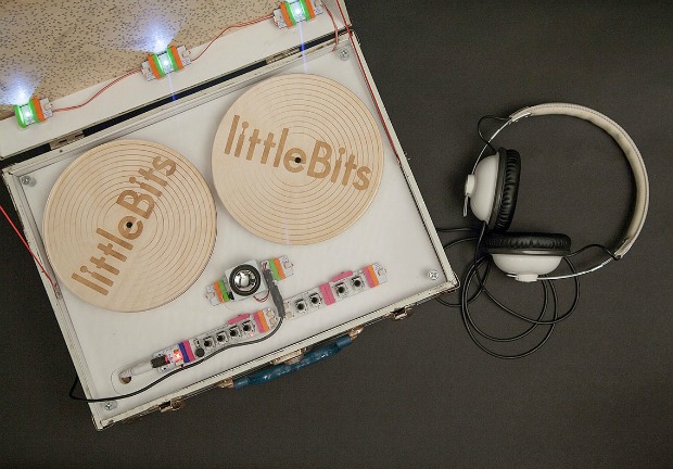
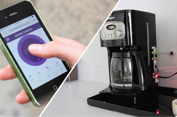
Developed by MIT Media Lab alumna and TED Fellow Ayah Bdeir, our Modular Synth, Space Science, and Smart Home kits offer an addictive introduction to the world of electronic components. By connecting the color-coded, magnetized modules like a brick building toy, you can create some awesome mad scientist devices and learn about the principles of technology in the process. The array of modules includes power, input, output, and wire (splitter or mixer) units, incorporating light, sound, sensors, and mechanical functions. Technical as this inventory may sound, the modular dimension provides a system that can be learned in minutes, and facilitates multi-media mixing of light, sound, and motion for limitless invention. Avowed “disinformationist” Reggie Watts shows just how much fun you can have through his improvisation with the Synth kit.

Modular Smart Home Kit | UncommonGoods

Modular Smart Home Kit

For those who may not even know they’re interested in electronics, Ayah’s invitation to play is enticing: “we’re trying to make [these modules] as accessible as possible and as instantaneous as possible, so you can see the results.” In her commitment to democratizing technology, she echoes cyberspace-defining writer William Gibson observation that “the future is already here—it’s just not evenly distributed.” For that matter, the culture behind these kits features an open source component, encouraging the sort of tool and material innovation fostered by Tulley’s tinkerers. Ayah comments on this aspect of her system:

We started to lose this ability to play with technology as technology started to become more finished and closed…[our goal] is to demystify technology…the magic of electricity is everywhere around us—it’s beautiful, and we have to contribute to it and be creative with it.

Still not convinced that a focus on the inner workings of electronics is a good idea? Allow us to introduce Milksop the Bear, a toy-meets-digital-communication critter that’s designed to divert kids from the inevitable pull of grown-up social media. He’s the invention of Guari Nanda, also a graduate of the MIT Media Lab, who comments “there are so many apps today that isolate kids from family…we wanted to create one that does the opposite.” Through his Wi-Fi connection and custom app, Milksop allows adults (mom, dad, grandma, grampa) to send messages to his kid companion. When Milksop grunts to say “you’ve got mail,” the messages are delivered in a whimsically modulated voice. Then, kids can respond by recording a voice message that’s sent back to their adult admirers through the app. No screen, no typing, no direct contact with the pitfalls of too much technology. Milksop utilizes kids’ natural tendency to have conversations with their toys, applying electronic components, code, and the cloud to connect generations, rather than giving kids too much screen time too soon. At the same time, parents can choose to use Milksop’s gentle take on cloud-based communication as their child’s first introduction to the digital world.

Milksop Bear | UncommonGoods

Milksop Walkie Talkie Mailman
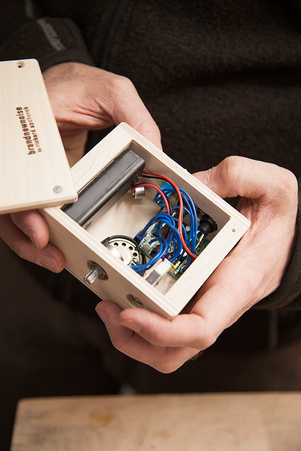
UncommonGoods’ family of techie toys also includes Richard Upchurch’s curiously cute Zoots, Lil’ MIB, and Loopy Lou. Each handmade gadget is part instrument and part pet robot, combining analog electronic components like those of Ayah’s kits within handmade, wood housing detailed with familiar, interactive buttons and switches. In keeping with their old school controls, Richard’s designs are kept deliberately simple, in that their recording functions are limited and ephemeral. Richard explains the reasoning behind this decision:

While we live in a culture of saving everything (voicemail, emails, social media feeds), I feel it’s important to celebrate the impermanence of things, to cherish the moment you’re living in. Take that moment, create within it, laugh, play, build a memory; then move forward into the next moment. It’s here that I find myself encouraged by the creative timing without being inhibited by comparing the past to present. This creates a space that allows us all—kids and adults—to play and create without inhibition.

From their handmade wood bodies to their whimsical, silkscreened “faces,” Zoots, Lil’ MIB, and Loopy Lou share the mission of Ayah’s modular bits—to make electronics accessible and endearing. For more on Richard’s easygoing but innovative approach to designing and building technological toys, follow along with our recent tour of his studio.

Lil Mib | UncommonGoods

A look inside Loopy Lou
Whether the future (or the unevenly distributed present, according to William Gibson) is shaped by products that encourage or discourage a direct interface with technology remains to be seen. Maybe a measure of both approaches is best. Going forward, 3D printing technology promises to continue the reconciliation of media and material, circuitry and stuff, bringing replicator-like integration between the physical and digital worlds. If it’s going to be this much fun, we say “make it so!”

Check out more tech toys! | UncommonGoods

Design

Maker Mentors: Advice on How to Make It

May 1, 2015

Maker Mentors | Sponsored by UncommonGoods


Taking the leap from making for fun to making professionally is a big step. A few pieces of good advice, positive vibes, and knowledgeable role models can go along way. Even better is a lot of great advice, an atmosphere alive with positivity and encouragement, and an active community of mentors–but it can be tricky to step away from the workbench to seek out educational opportunities, especially when starting a new business. That’s why we’re so proud to sponsor an innovative new conference that takes place entirely online!

Maker Mentors is online and everywhere May 14-16, 2015, so you can attend without buying a plane ticket, dealing with hotel reservations, or even getting out of your PJs. You can even get a $50 of discount off registration by entering the code UNCOMMONGOODS at checkout when you sign up! And, at the risk of sounding a bit like an infomercial, we’ll go ahead and say, “but that’s not all!” Because we’re really, really excited about this next part…

As part of our work with Maker Mentors we’re presenting a series of free webinars featuring our artists throughout May and June! First up is the ever entertaining and informative jewelry designer Emilie Shapiro on May 4th at 5 p.m. PST. (8 EST.)

Sign up for Emilie’s free webinar here and register for the Maker Mentors newsletter  to stay in the know as we add additional artists to this series.


Design

Uncommon Design School: The Origins of Earth Day & the Green Design Movement

April 9, 2015

As Earth Day celebrates its 45th anniversary this year, it’s hard to believe that the concept of “going green” is still relatively new. While we’ve come a long way as individuals to evaluate our environmental impact, the countless designs that we interact with on a daily basis have, too.

Planting Flowers

The UncommonGoods team planting flowers for Earth Day.

In the decades prior to the establishment of Earth Day, the manufacturing industry was more interested in making green than going green: factories belched out clouds of black smoke; toxic chemicals were dumped carelessly, polluting the soil and groundwater; and bottles, cans, and paper were all destined for the landfill after just one use. At the time, most people remained blissfully unaware of the consequences of overconsumption and how negligent manufacturing practices were wreaking havoc on the planet.

After witnessing the ravages of the 1969 oil spill in Santa Barbara, California, Wisconsin senator Gaylord Nelson had the idea of bringing environmental issues to the public eye by creating an event infused with the same energy as the anti-war protests occurring at the time. On April 22nd, 1970, his simple idea for a teach-in exploded into a national event uniting 20 million people under one common goal: raise awareness about environmental impact. The little holiday that could led to the creation of the United States Environmental Protection Agency and the passage of the Clean Air, Clean Water, and Endangered Species Acts.

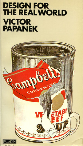
During the same era of change, Vienna-born designer Victor Papanek quietly penned his cri de coeur, Design for the Real World: Human Ecology and Social Change, an impassioned plea for reform that laid the foundation for the emerging sustainable and humanitarian design movements.

Design For the Real World

 Design for the Real World: Human Ecology and Social Change, Paperback, Second Edition, Published August 30th 2005 by Chicago Review Press (first published 1972), image via Goodreads

“There are professions more harmful than industrial design, but only a few,” he writes at the start of his 1971 manifesto. In addition to pillorying his peers for producing shoddy, stylized work that wasted natural resources and aggravated the environmental crisis, he also introduced the idea of socially responsible design. Calling designers “the handmaidens of capitalism,” Papanek advocated for a triple bottom line policy, in which people, planet, and profit are interconnected and should be considered together.

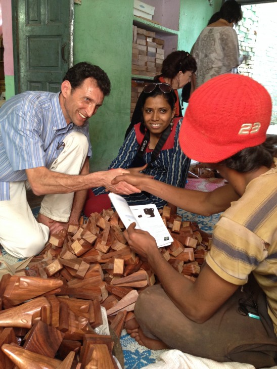
Dave Bolotsky meeting with Artisans in India

UncommonGoods Founder & CEO Dave Bolotsky meeting with artisans in India.

To Papanek, ecological and social responsibility are the twin pillars of the design practice and his advice has gone on to influence a generation of designers as well as businesses like ours. As a founding B Corp, we meet rigorous standards of social and environmental performance, accountability, and transparency. We’re also proud to support designers with a similar agenda, who make it their business to come up with better design solutions for people and the planet.

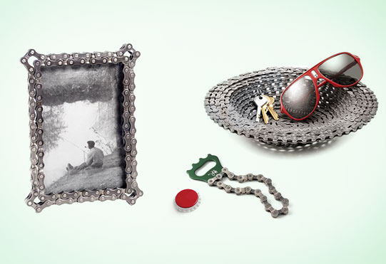
Bike Chain Designs by Graham Bergh | UncommonGoods

 Reclaimed Bike Chain designs by Graham Bergh

In 1991, after getting a flat tire while riding his bike, Graham Bergh was inspired to salvage the materials to make something new and totally unexpected. Every year, his team of bicycle craftsmen collects thousands of pounds of used parts, drawing from bike shops nationwide, and revives them into creative home accents.

Graffiti Jewelry | UncommonGoods

Graffiti Jewelry Collection by Amy Peterson and Diana Russell

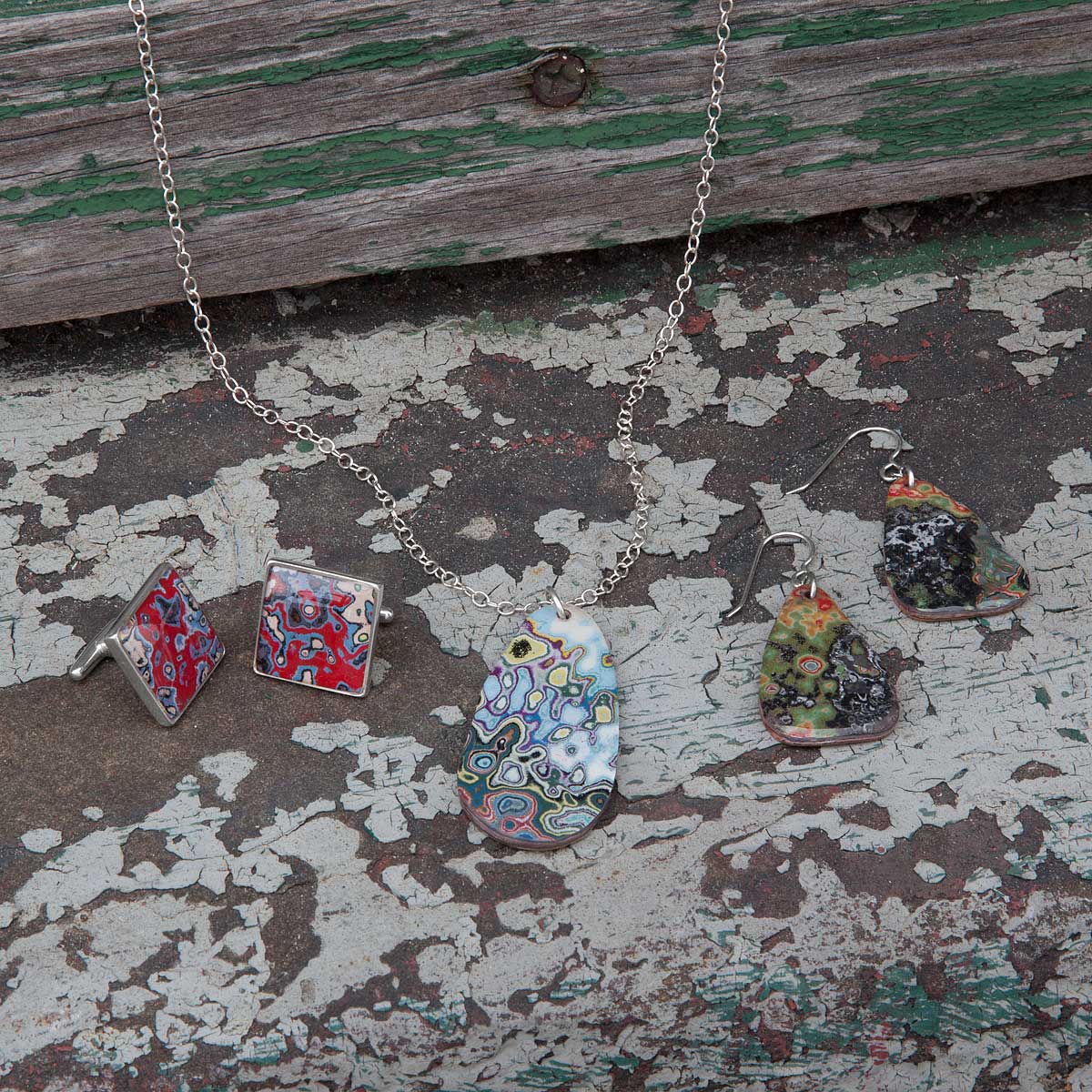
After encountering the crumbling walls of graffiti throughout Detroit, Amy Peterson and Diana Russell found the inspiration to turn these bits of urban detritus from around the Motor City into one-of-a-kind remnants of its vibrant street-art scene. Together, they work with women from local shelters to create beautiful works of art that also have a beautiful mission to improve the lives of the people in the community.

Puppet Pals | UncommonGoods


Edgar and Ollie the Puppet Pals by Jen List and Stacey Waddington

When Jen List and Stacy Waddington stumbled upon a heap of unwanted sweaters and shirts, the duo decided to transform the old fabrics into a line of snuggly and imaginative children’s toys and accessories that encourage early learning and individual expression through creative design, wonder, and storytelling.

How do you plan on celebrating Earth Day, and what “green” practices do you incorporate into your life?

Design

Uncommon Design School: Less is More

February 13, 2015

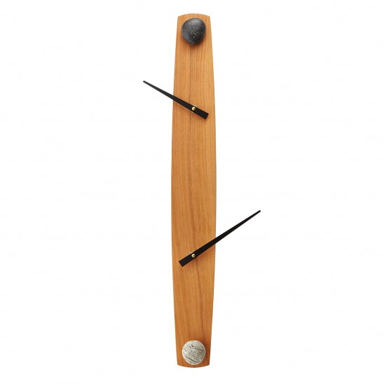
Love it or loathe it, we all know minimalism when we see it. A neutral palette comes to mind. Forms tend to be aggressively geometric. International Style buildings…Scandinavian furniture…deconstructed timepieces like our On the Other Hand Clock. Some find minimalist designs thrilling in their integrity. Others find them stark—even threatening. Whatever your reaction, one handy phrase comes to mind: less is more.

On The Other Hand Clock | UncommonGoods

On the Other Hand Clock

A conceptual cousin to ‘form follows function,’ this cool but cheekily contradictory aphorism is a close contender for the top modernist mantra—a quotable bit of wisdom that may still be echoing through the lecture halls of many a school of architecture and design. But, like Louis Sullivan’s alliterative catch phrase, less is more deserves an investigation of its history.

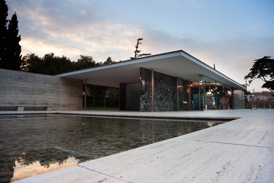
The phrase is most closely associated with the designer who embraced the association: architect Ludwig Mies van der Rohe. For Mies, it was an apt slogan for his pursuit of design purity. The intentional contradiction helps make it memorable, but essentially it means “the less complicated the design, the better.” The less of less is more is apparent in the work of Mies and other midcentury modern designers, but the more means ‘better,’ with a note of pseudo-spiritual zeal.

Barcelona Pavilion | Wikipedia

The Barcelona Pavilion designed by Ludwig Mies van der Rohe, Wikipedia

Much as Mies’ cigar-puffing visage comes to mind when you hear the phrase, he had to admit that he didn’t coin it. He credits his modernist mentor, Peter Behrens. The young Mies, working in Behrens’ studio, recalls that he showed his boss some design options for a factory façade, to which the elder architect replied “less is more.” This set the tone for Behrens’ elegantly minimal approach to industrial design, and Mies took up the banner for other types of buildings as well.

But wait—there’s more (or is it less?) to this story. The phrase crops up before Behrens was born, in a poetic context: Robert Browning’s poem Andrea Del Sarto (called “The Faultless Painter”) of 1855.

Yet do much less, so much less, Someone says,
 (I know his name, no matter)—so much less!
 Well, less is more, Lucrezia: I am judged.

Browning employs the phrase in an imagined diatribe by a B-list Renaissance painter who works in the shadow of the likes of “Michel Agnolo” (Michelangelo). Hardly the heroic, modern origins you might expect.

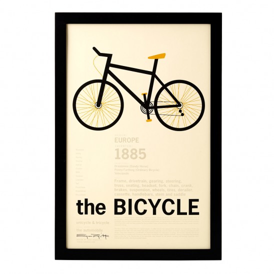
Bike Print | UncommonGoodsThe Bicycle Encyclopedic Print

Whether or not Behrens and Mies were aware of Browning’s poem, the phrase got a modern makeover that puts a positive spin on minimalist aspirations. Not to be outdone, maverick architect Frank Lloyd Wright quipped “less is more, only when more is no good.” Apparently, Wright wanted to indicate that he was hip to mid-century trends, yet wanted to keep his options open.