Browsing Tag

Design

Design

Square Bottle’s Refreshingly Clean Design

May 15, 2013

That stinky muck that likes to lurk in the deepest, darkest parts of your drink bottle finally met its match–but only after inspiring Clean Bottle founder Dave Mayer to invent a better bottle.

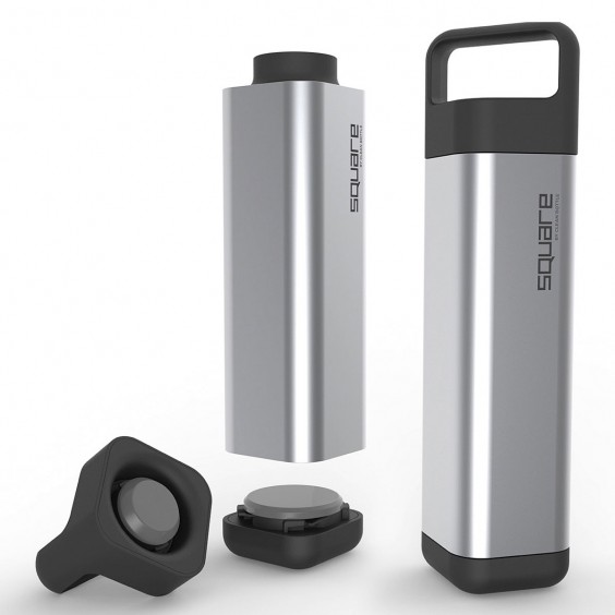
Square Water Bottle

The moldy mess lead to the creation of an innovative product–a sports bottle that opens on the top and bottom to allow for complete cleaning, but Dave, a triathlete himself, and his team of designers and engineers weren’t done there. Realizing that the design could still be improved, the team set to work to create the Square Water Bottle.

Dave running in the Ironman Triathlon

“I saw that everyone was carrying water bottles but they all had the same dull ‘fuel canister’ look and had some real design flaws,” said Dave. “We wanted to create a bottle that was as aesthetically pleasing as the clothes, handbags, shoes and phones that people also carried with them.”

The shape wasn’t hard to come up with. A square bottle makes sense, because it won’t roll away if knocked over or accidentally dropped. The challenge was making the product they envisioned a reality. It took time, but after around 40 mock ups and prototypes the Square Bottle was born. “Our final product stayed mostly true to the original design,” said Dave. “It took longer to not make compromises but it was worth it.”

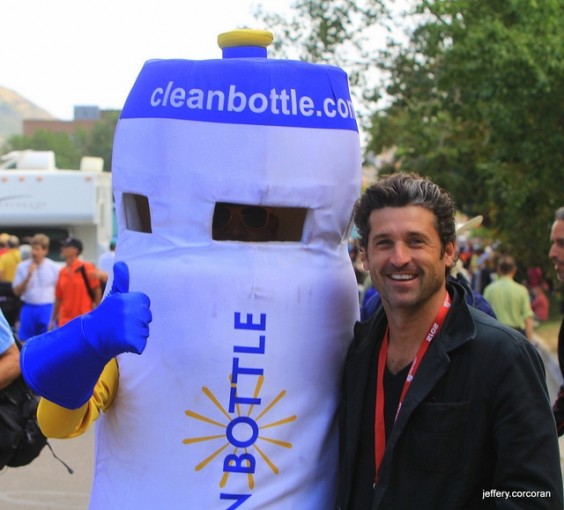
Dave as “Bottle Boy” posing with actor Patrick Dempsey and Bottle Boy running alongside cyclists at the Tour De France

The Square Bottle, like it’s predecessor, the original Clean Bottle, is easy to clean, because it screws open at both ends. It’s also durable, because the body is made of durable stainless steel, while the BPA-free plastic Vibrant Fresh Taste Lid ™ keeps your drink from taking on a metallic taste. The bottle is also slim enough to fit in a cup or bottle holder and is complete with an ergonomic handle, so it’s comfortable to take on the go.
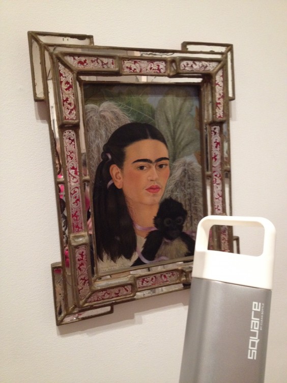
Square Bottle on the go with Freda

Creating something that had never existed was no easy task, but time, collaboration, and hard work made it possible. “It was extremely difficult to do a Square bottle – there is a reason no one has done it, but we wanted something totally unique,” Dave,who uses the product himself every day, explained.

“People either want the cheapest or they want the best,” he said. “Aim to be one of these two and create a truly unique product and you will succeed.”

Maker Stories

Cloudy Mountainscape for the Win

May 9, 2013

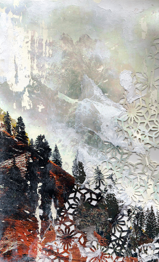
I actually couldn’t wait to sit down to this year’s Art Contest judging-and not because I’m an uber fan of the Jealous Curator. I knew it was going to be a really close contest with every one of the top five voted pieces being so special and so unique.

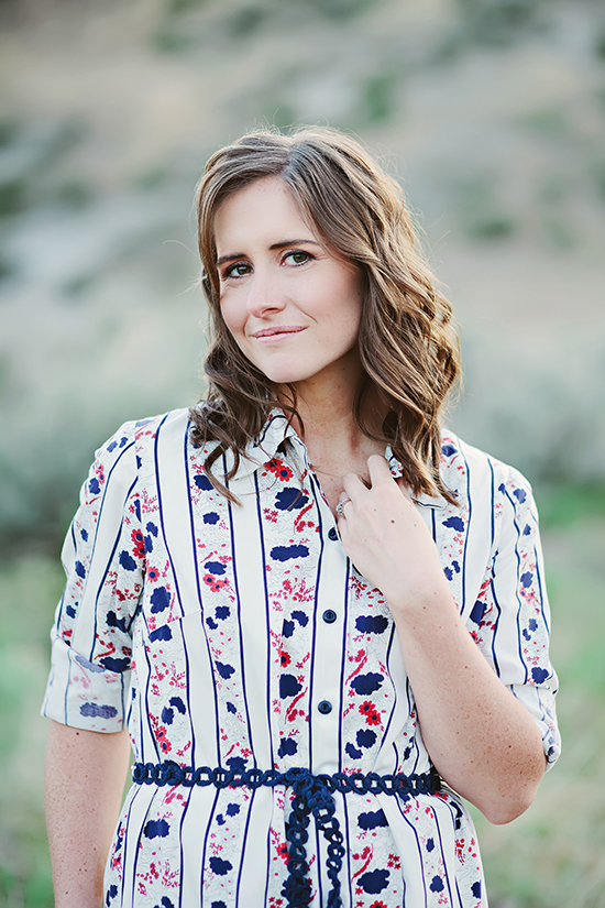
And I was right. It came down to two paintings but eventually Katie, Danielle and Matthew arrived at a consensus–Elise Wehle’s Cloudy Mountainscape was too exceptional to pass up and its paper cut texture would make an incredible print. So meet Elise, the winner of our latest design challenge and help us welcome her into our artist family!

What is one uncommon fact about you?
I’m still an avid Mario Kart racer for the Nintendo 64.

When did you first realize you’re an artist?
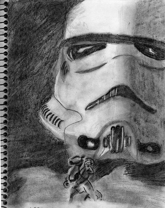
As a kid I used to love to draw animals. Everyone, including myself, thought I was going to grow up to be a zoologist. It wasn’t until middle school that I branched out and started drawing Star Wars characters (yeah, I was pretty nerdy). However, my nerdiness worked towards my benefit, and I realized I just loved drawing and making art more than even the subject matter. Soon after I decided I wanted to be an artist.

Where do you get inspiration for your art?
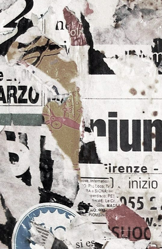
I definitely find inspiration from city walls covered in old and new posters. I can almost see the history of the wall when I tear off one poster only to discover another one underneath. I love when all the different layers of posters turns into one giant collage. I think the way time weathers and tears the paper is very beautiful. I try to copy that look in a lot of my work.

Describe your artistic process.
I usually start an artwork by finding an image or a photograph that I really love online. I like the idea of taking something that only exists as bits and pixels and turning it into something real and tangible again. I materialize the image by creating a transfer of the photo. Sometimes this is done through intaglio, a printmaking process I learned while in college, or sometimes I use gel medium and transfer the photo directly to paper. I then try to incorporate some type of hand-intensive technique into the artwork, usually in the form of weaving, paper cutting, or embroidery.

Describe your work space.
Oh boy, my work space is nothing fancy. Right now my studio is a small corner of my bedroom. In that corner I have a desk, a lamp, and a little stool, all three of which are covered in art supplies. Usually and inevitably, my creative process begins to spread all across the bedroom until the bed and floor are covered. Luckily, my husband has the patience of a saint and hasn’t complained about all the little pieces of paper we end up tracking across the house.

What advice would you give to another artist interested in entering one of our design challenges?
My first bit of advice would simply be to enter the competition. Don’t prevent yourself from taking advantage of such an awesome opportunity by worrying about whether your art is good enough. Just enter it and see what happens. You have nothing to lose and everything to gain. Those circumstances are not very common and should always be ventured.

My second piece of advice goes hand in hand with my first. I think Andy Warhol summed it up perfectly. He said, “Don’t think about making art. Just get it done. Let everyone else decide if it’s good or bad, whether they love it or hate it. While they are deciding, make even more art.” Whatever the outcome of this competition or any other artistic venture you attempt, don’t worry too much about the results. Just keep making more art. If you’re consistent, you’ll eventually stumble upon a great artistic breakthrough that someone will notice and adore.

Check out The Jealous Curator‘s post about Elise’s art!

Design

TPC Sawgrass Golf Ball Cufflinks Tee’d Up for Tournament Time

May 9, 2013

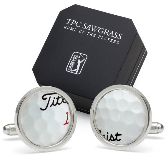
With THE PLAYERS Championship underway we’re quietly and quite politely clapping in celebration of one the newest additions to our men’s accessories assortment, PGA TOUR licensed TPC Sawgrass Golf Ball Cufflinks.

These sterling silver cufflinks feature material reclaimed from actual golf balls collected from Sawgrass’ iconic 137 yard 17th hole. While a few pro balls are sure to find their way into the water surrounding the hole during the week-long tournament, the rest of the year the course, located in Ponte Vedra, Florida, is open to the public, helping to create quite a bounty of sunken ball treasure.

As you’ll see in the video below, these balls aren’t exactly easy to recover. It takes a little hunting and some scuba gear to get them back to the green.

Milan Micich, Designer and Sales Manager at Tokens and Icons feels that sterling silver is the perfect complement to these carefully recovered golf balls. “Sterling silver, like TPC Sawgrass itself, is a rich experience,” he said. “There is only one Sawgrass, only one 17th hole island green, designed by Pete and Alice Dye, themselves icons in golf course design. It’s on every weekend golfer’s bucket list, and if a diver is going to evade alligators to scoop mishit balls off of the lake bed, the balls deserve being set in sterling silver.” (After seeing Mr. Gator show his head in that video, we definitely agree!)

“This is a gift [you] can give to a guy that connects to his emotions of having played or wanting to play this famous course and try his luck at 17,” said Milan. “Golf is a place you’ll see men laugh, shout, bicker, cry (ok, whine) and hug all in the space of an afternoon and talk about it for a lifetime…especially should a few go into the drink.”

Maker Stories

Inside the Artist’s Studio with Kristy Hadeka & Sean Tice

May 7, 2013

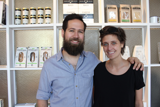
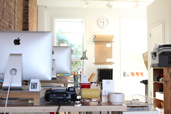
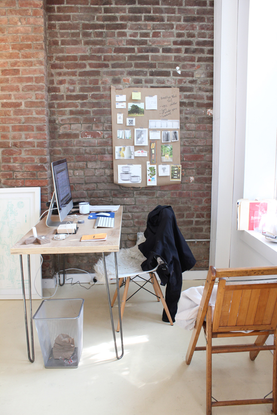
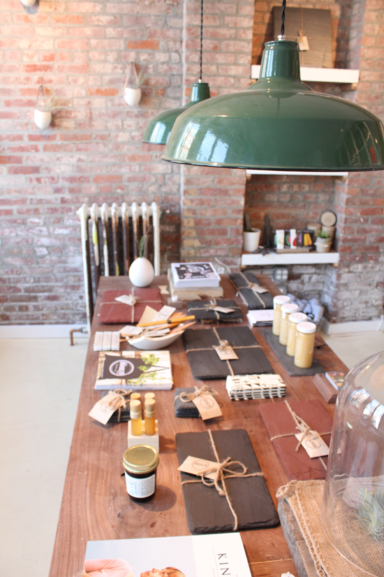
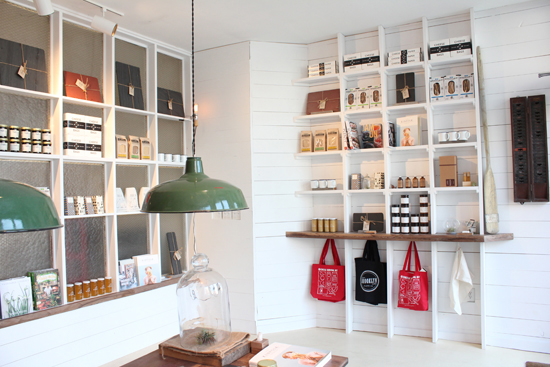
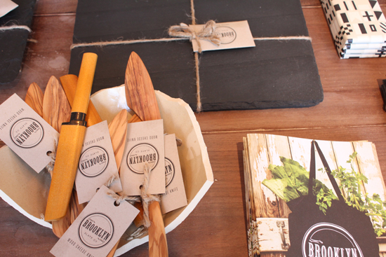
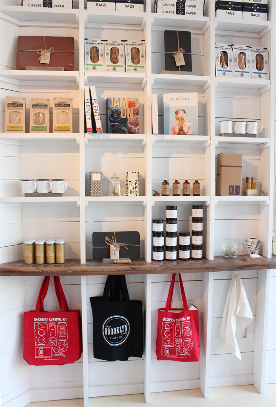
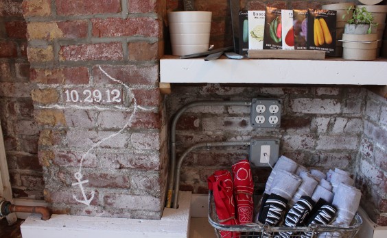
Days before I made it to the Red Hook work space of Sean Tice and Kristy Hadeka, they were putting the finishing touches on Brooklyn Slate Co’s new home, a space that took a hard beating during Hurricane Sandy. A line painted on an exposed brick wall shows where the water came up last October. At the time they were beginning construction on their new office and showroom, and had begun to store all of their merchandise and computers.

Months later, their space is a rustic, welcoming meeting space where they can work on new designs and meet with clients. I was happy to learn that behind the homey facade, Sean and Kristy were as warm as their aesthetic–serving as true advocates of their new neighborhood and neighbors. Take a look inside their work space and see what makes Sean and Kristy (and Garp) of Brooklyn Slate Co such Uncommon Artists.

What are your most essential tools?
Sean: An oversized work table, drafting light box, and good music playing. Editor’s note: The music was indeed very, very good.

Where do you find inspiration within this space?
Kristy: When we found this space, it was completely stripped down and raw. We built it out using materials and colors that make us feel really comfortable and at home. It’s open, airy, and relaxing – perfect for finding inspiration.

Where does down time fit into a day in the studio?
K: Red Hook is a great neighborhood to walk around and explore – whenever we need a few minutes, we pick a direction and go for a walk.
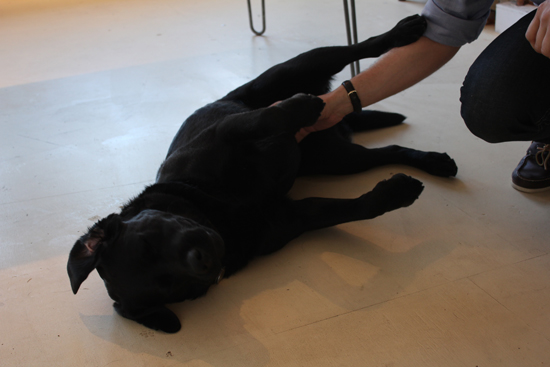
S: Our dog also accompanies us at the shop on most days, so we take him to the park in the morning and late afternoon. I usually stop by Baked for a coffee or tea, then we go and throw the ball around.

What was the toughest lesson you learned as a young designer starting a business?
K: You should never be afraid to ask for help. Whether you need feedback on an idea you’re working on, or you find yourself managing an area of the business with which you have no experience, it’s important to know you can always go to someone you trust for feedback.

How and when do you decide to celebrate a victory?
S: We celebrate small victories every Friday with Beer Friday, when we pair a new beer we haven’t tried before with a cheese. Often, someone on our team will bring in something homemade for us all to enjoy, and we’ll pair a beer with that.
K: A big victory always requires the team head to the Ice House, one of our favorite watering holes in the neighborhood.

What are some new skills you are trying to acquire to perfect your craft?
S: We recently started developing other tabletop items that aren’t necessarily made of slate. I typically sketch ideas by hand, but I’m learning Google SketchUp so I can create more detailed renderings.

How do you recharge your creativity?
K: We both love running. It’s a great way to reset or gain perspective, especially when you’re stuck on an idea. There’s also so much to see in New York, and running is the best way to do it.

Where does collaboration come into play with your craft?
S: Collaboration comes into play in two ways – on the one hand, we’re always exploring ways to collaborate with other producers in New York. Within the company, everyone is encouraged to speak up as new ideas come to them. Our shop and office are one and the same, which encourages open communication between everybody. Even if you’re not participating in a particular conversation, just overhearing a discussion can plant a seed in your own mind.

Design

Art Crush: Denise Fiedler

May 3, 2013

I think I have spring and summer fever. The lingering cold and snow here in Colorado has me daydreaming of warmer temperatures… and crushing on Denise Fiedler’s collages. They capture that easygoing charm of summertime so perfectly.

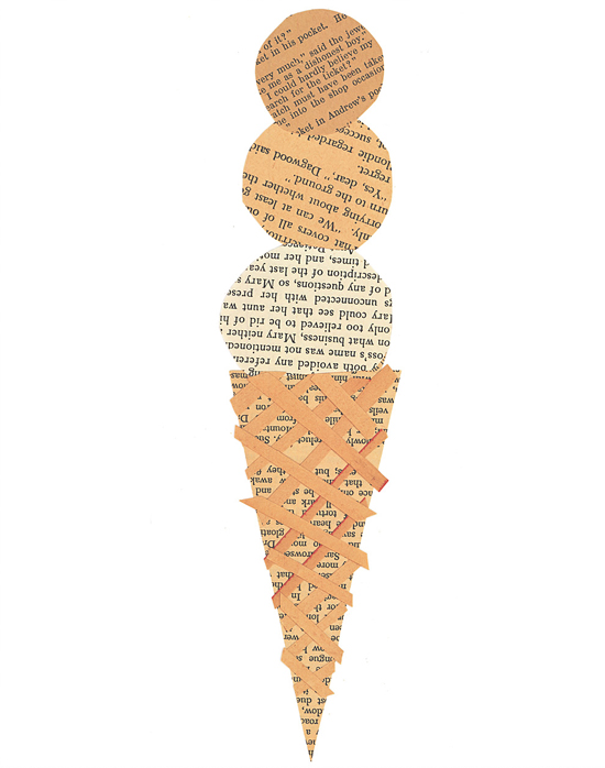
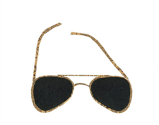
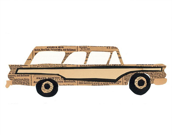
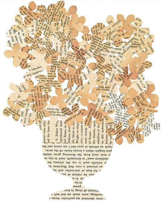
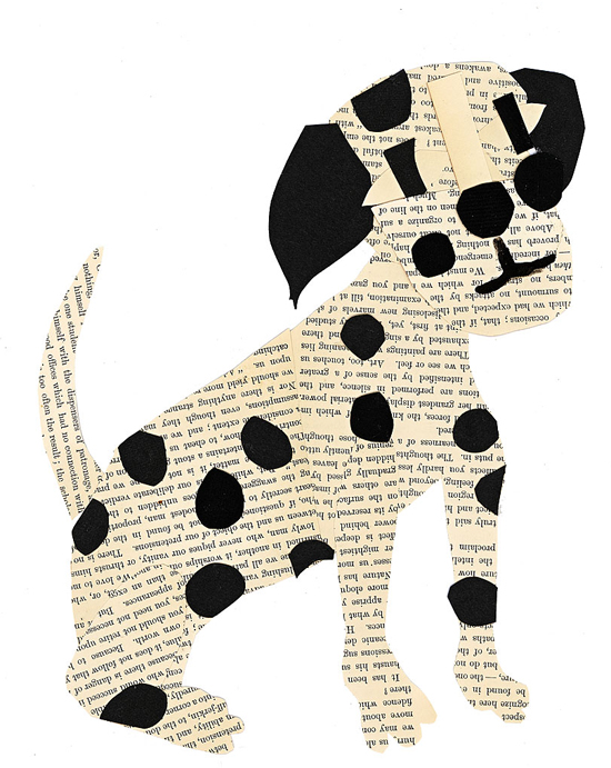
Denise started making collages in 2009 after one serendipitous bout of spring cleaning. While going through her attic, she stumbled upon a box of vintage books and newsprint, which she’d collected over the years from flea markets. Inspired by her forgotten treasures, she decided to transform these ephemeral materials into works of art. She calls this unique artistic endeavor paste.

The yellowing pages and iconic subject matter give her work a wonderful sense of nostalgia. It’s like we’re looking into the past at a simpler time of bicycle rides, ice cream cones, and family road trips in the ol’ station wagon.

To construct these delicate outlines, she carefully carves silhouettes from the vintage pages and assembles the cutouts to adeptly capture the design and essence of her subjects. Denise draws inspiration from a variety of sources, including architecture, animals, food, and people who have caught her eye.

Which one is your favorite? I think I need the ice cream collage. Just imagine, it would be summer on my wall all year round… that sounds pretty great.

See more from Denise in the Uncommon Artist Gallery and read more about the works featured above: Ice Cream, Sunglasses, Woody, Hydrangeas, Dogs.

Design

How to Win a Design Challenge

May 1, 2013

After facilitating 11 design challenges over the past year, I consider myself our company expert. I sit with the buyers as they sift through the entries to decide on the semifinalist designs that will make it to our community voting app, moderate the final judging session, and communicate with the designers throughout the entire process. I am to the point now where I can anticipate what the buyers will say about each entry and finalist design so I thought it would be helpful for me to share some of my observations.

Of course the final decision always comes down to the design and how well the buyers think it will sell at UncommonGoods, but keeping this advice in mind will help you avoid some road blocks that I have seen make or break the final decision.

PRICING I thought I’d start with the technical stuff to get it out of the way and because this is a really important factor in most design challenges. UncommonGoods is a retailer so we buy artist’s goods at a wholesale price. After we buy your design from you, we still need to make a profit, so we need to have a retail price set with a fair profit margin. We measure gross margin % to gauge profitability. We calculate this with (retail price – wholesale price)/retail price x 100 = GM%.

But if you have only been selling on Etsy and at flea markets, you might not have a wholesale price figured out yet. Many independent sellers are currently selling their items retail at a wholesale price! Stores like UncommonGoods will need to charge almost two times that amount to make a profit, and we won’t want to sell your design at a much higher price than a customer can get it on your site. This might mean going back to the drawing board but a strong pricing structure could really benefit you in the future.

Senior Buyer Erin Fergusson advises, “Research what is out there in the market place and understand the range of retail prices for similar products. Be sure to note the materials and how something is produced (handmade vs. manufactured) in order to understand where the cost is coming from.”

To understand pricing a little more, check out this really informative forum discussion between Etsy sellers.

Tell your product story well and completely! Some artists do a great job telling the story of their design in the Product Description field on our online submission form. Some artists don’t and it can really hurt them. This is the space to let us know all about your inspiration, your artistic process and how the design makes you feel. This is the space to tell our buyers everything you want them to know about you and your art.

If your design is chosen to be a semi-finalist, this is the copy we will edit for grammar and punctuation to use in the community voting stage-so this story won’t just attract our buyers, but also the thousands of voters who will be viewing your design. Good product copy can make or break your chances with the voting community, the buyers, and the rest of the judging panel.

Our buyers love collections. When I sit with a buyer and go through design challenge submission, more often than not we are also visiting an artist’s website to see what else they have. Not because we’re nosy, and not because we don’t like what we see. Our buyers want a sense of an artist’s future as a vendor at UncommonGoods. They’re looking for an artist that will be able to create a collection of similar products. Check out Valerie Galloway and Etta Kostick – former design challenge participants with robust collections.

Be prepared for our inventory demands. Our inventory requests for each design are always different depending on price and category, and our buyers work to create a plan with each designer that is beneficial to both parties. One common question you should be able to answer is “how many of these can you make in a week’s time?” Don’t know the answer to that question because you’ve only ever made one? That’s ok too, but have a plan in place for scaling up. (Get some advice from our current vendors here!)

Send a product sample, NOT a prototype. Most challenges require the semifinalists to send in their design for the buyers to review. Even if a design doesn’t make it into the top five designs that are judged, the buyers will review all the samples that come in. So many other artists are eager to get their designs into our buyers’ hands-but so many times I see samples with unfinished edges and chipping paint. Who knows when you will get another chance.

Send them something that shows the true extent of your talent. Before you send out your sample think, is this something I would send to a paying customer? Remember, when our buyers have your design in their hands they are thinking the exact same thing.

Stay tuned to our Twitter to learn about new design challenges and enter our Art Contest all year round!

Design

Art Crush: Audrey Heller

April 26, 2013

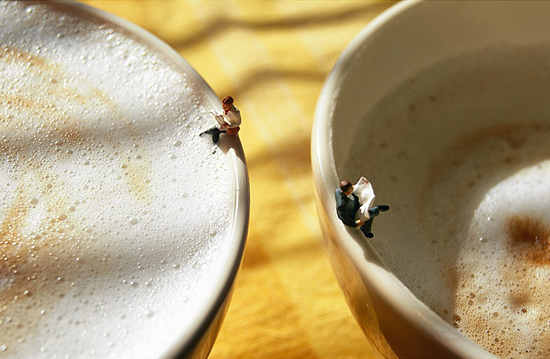
Miniatures fascinate me. Maybe it’s because I watched the movie Honey, I Shrunk the Kids a lot when I was little. Or maybe it’s the fact that I’m 5’3″ and holding tiny things makes me feel like a giant… we’ll never know, but I do know this: Audrey Heller’s photographs are seriously crush-worthy.

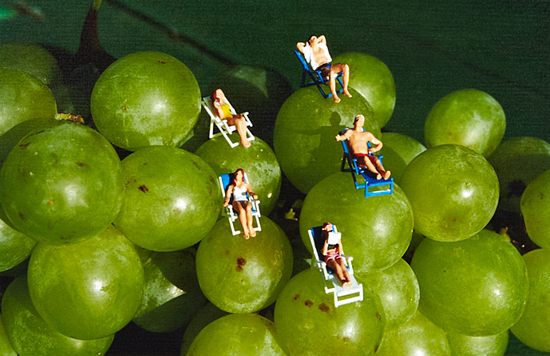
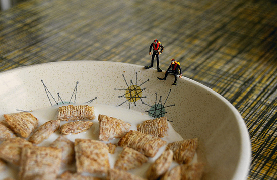
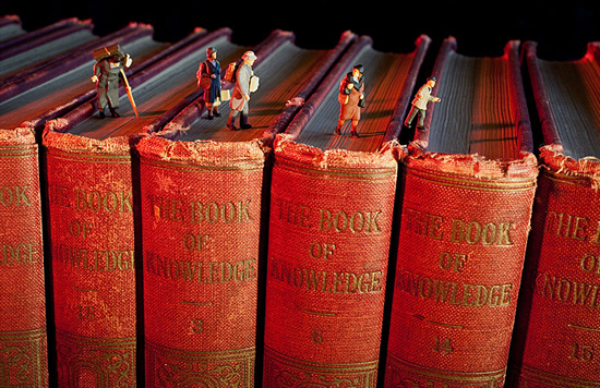
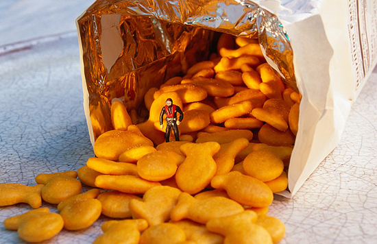
Audrey transforms common foods and objects into exciting uncharted worlds for her tiny figurines to explore. Her playful and imaginative juxtapositions create some pretty surreal scenarios. Ordinary objects like grapes, cappuccinos, and breakfast cereal become unfamiliar – even dangerous – landscapes.

Like film stills, Audrey’s photos leave you wondering what came before the scene you’re looking at and, more importantly, what will happen to our tiny protagonists next. I’m a little worried about those scuba divers… I mean, how will they get out of that bowl? What if they get eaten? What happens when that shredded wheat gets soggy? Because you know it will…

Audrey is truly my favorite kind of artist – one who thinks outside the box and inspires us to do the same. You can’t help but use your imagination when looking at her photos. They make you think and that’s really what art should do, right?

Audrey Heller lives and works in her native San Francisco Bay Area. Since 1996, her photographs have been shown, shared, published, and collected around the world.

Get a peek inside Audrey’s studio here and learn more about the works featured above: Ripened, Cafe Society, Challenging Conditions, Bound, Fish Out of Water.

Design

Constellation Collaboration: Creating the Zodiac Pillows

April 15, 2013

All great designs start out as great ideas, and while we often think of great ideas as masterpieces that burst forth from the minds of individuals, in reality, many are actually the product of collaboration.

For our product development team, collaboration has a major part in creating dynamic new goods. Sometimes the idea for a new exclusive designed-by-us product is conceived in a brainstorming session, sometimes it’s the result of discussions with our buyers, and, as in the case of our colorful Zodiac Pillows, sometimes the idea is built around existing artwork.

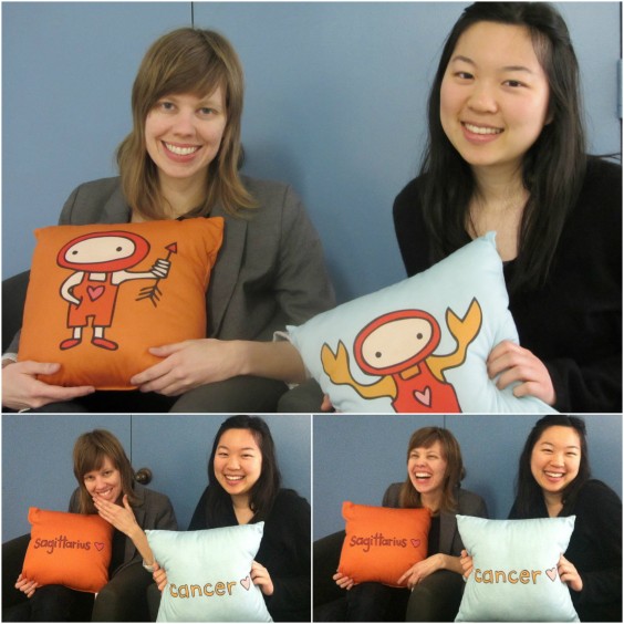
Senior Product Development Associate Sarah Stenseng, Product Development Associate Tiffany Jyang and their zodiac characters

Before our product development associates Sarah and Tiffany got to work designing these plush pillows, the adorable astrological characters featured on them started out as illustrations by artist Mark Poulin.

“Mark’s artwork informed the materials,” said Tiffany. “The characters are bright, fun, and colorful, so we knew the product had to be huggable.”

Mark agreed that UncommonGoods had to take his designs in the “huggable” direction. “It was all about the cute,” he said when asked what (besides the zodiac symbols themselves, of course) inspired him. He continued, “My goal was to make cartoon characters that would appeal to anyone with a heart and with a sense of goodwill. After all, you do have to feel comfortable snuggling up on the couch with these guys!”

Since there are 12 original zodiac signs, the team knew they had to create a product that could be consistent across several styles, while letting each character’s personality shine through. They decided that pillows were the perfect way to display Mark’s creations, because they are soft, squeezable, and fit into a variety of home decor styles.

“Part of what makes these zodiacs uncommon is that they are lovable, which isn’t something you usually think of when you think astrology,” said Sarah.

Mark himself jokes about his own feelings about astrology. “Secretly I’m a zodiac fanatic,” he said. “Not the reading the columns kind of guy, but the always trying to guess peoples signs based on their behaviors kind of guy. There’s nothing wrong with a little astrology mixed with numerology and maybe a dash of tarot, as long as you don’t talk about it in interviews…whoops!”

Artist Mark Poulin

That idea of blending the symbolism of the zodiac characters into everyday life was also a factor in creating these pillows. The team wanted the youthful series to appeal to fun-loving folks of all ages. And, since they really are functional pieces, that look lovely on your bed our couch, but are also soft and comfy when you rest your head on them or snuggle up with them, they had to be durable.

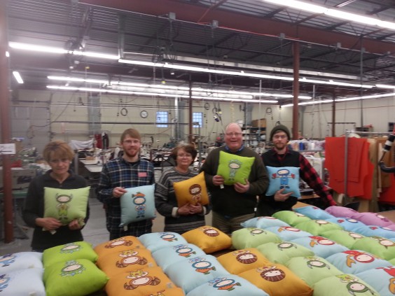
Fortunately, Tiffany and Sarah didn’t have to look far to find a vendor who could produce quality plush products. UncommonGoods has worked with Green 3 for years, and knew they were a great choice to help take the zodiac pillows from a concept to an uncommon good.

This next level of collaboration started with Jim Martin, who co-founded Green 3 with his wife, Sandy. “Our reaction to the designs was positive as soon as we saw them,” Said Jim. “We liked the icons and felt that had a very modern feel. We also really loved the saturation of colors.”

It was important to Jim and the team at Green 3 that the artwork was reproduced faithfully, without limiting the usefulness of the pillow or making the price point too high.

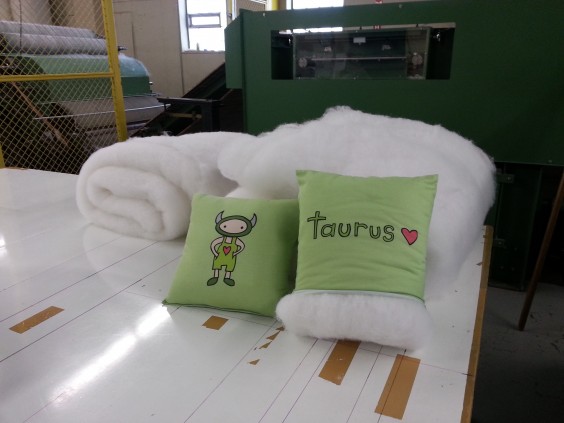
Zodiac Pillows in production, photos courtesy of Green 3

Since these factors are also important to our product development team, Tiffany and Sarah worked closely with the other collaborators creating mock-ups, working out kinks, making needed tweaks, and striving to hit a deadline–motivated to get the product perfect in time to appear in our next catalog.

The team also reached out to our online community, through the community voting app, to get feedback before releasing the final version of the product.

“We saw a fair amount of positive comments, ” said Tiffany, “which helped us gauge customer reaction to the product.”

Our product developers were encouraged by kind words from our voters, and couldn’t wait to see the finished pillows, and when the first shipment came in, they were both relieved to see that the product was finally here and excited to be able to start getting the cuddly characters out to customers.

Although seeing a product like the Zodiac Pillows through from an idea inspired by charming artwork to a tactile piece does involve a lot of moving parts and collaboration, it’s definitely worth the time and effort to see the end result–a design that can’t be found anywhere else!